AI
Two decades of art direction, pointed at a new set of tools.
Two kinds of work here. The systems are real: agents built inside a live client program. One automates creative QA across a high-volume email pipeline. One puts brand knowledge into the hands of art directors generating imagery. One lets clients search two years of past work before anything gets built from scratch. Some are running today, one is retired and waiting on a rebuild.
The imagery studies are self-directed, tests of what generation can actually do under real brand constraints, and where it falls apart. A label that has to stay exact across five lighting conditions. One person's face holding across ten frames. A real product placed into rooms that don't exist.
Different problems, same discipline: the tools aren't the differentiator, the art direction is.
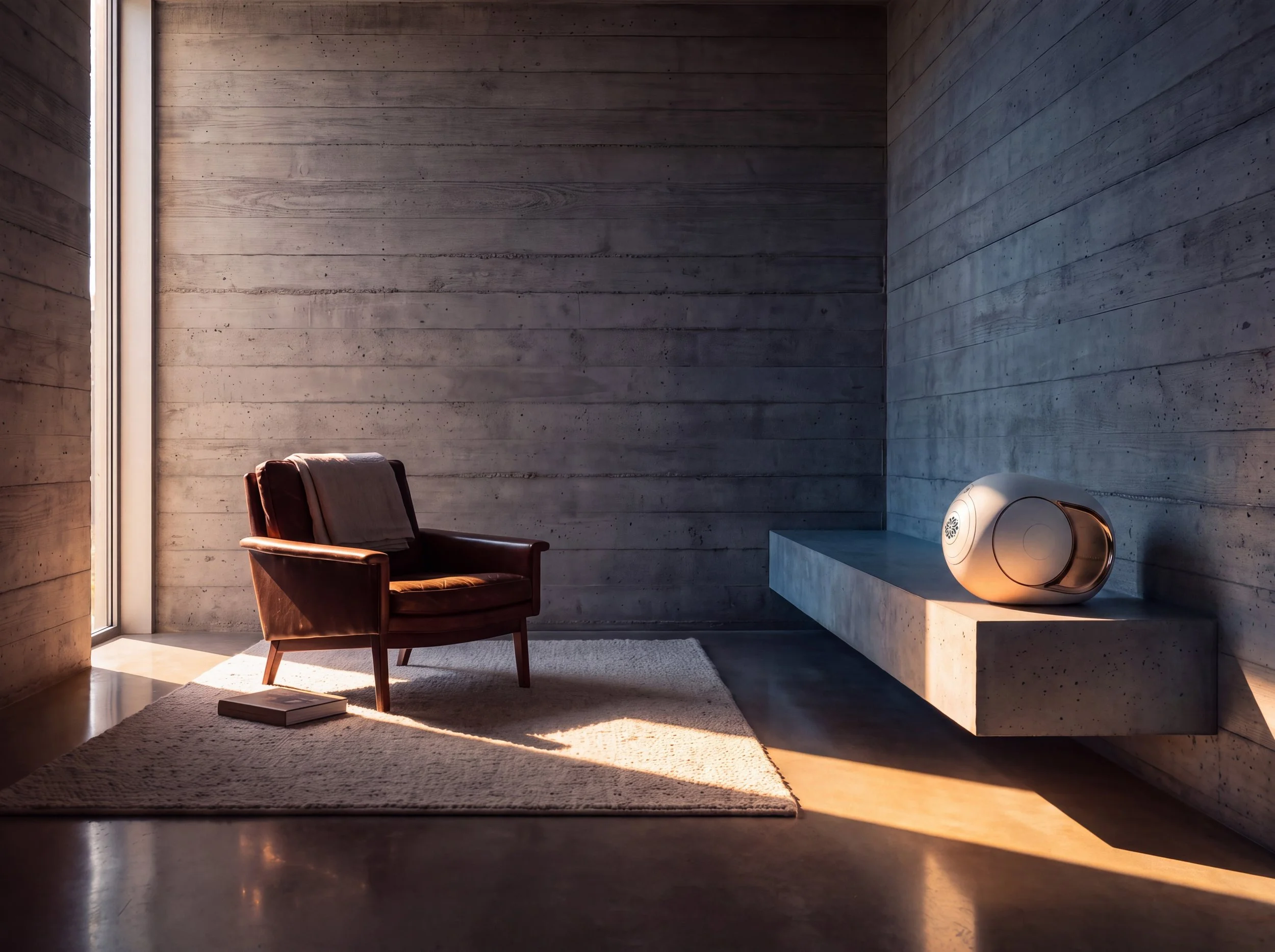
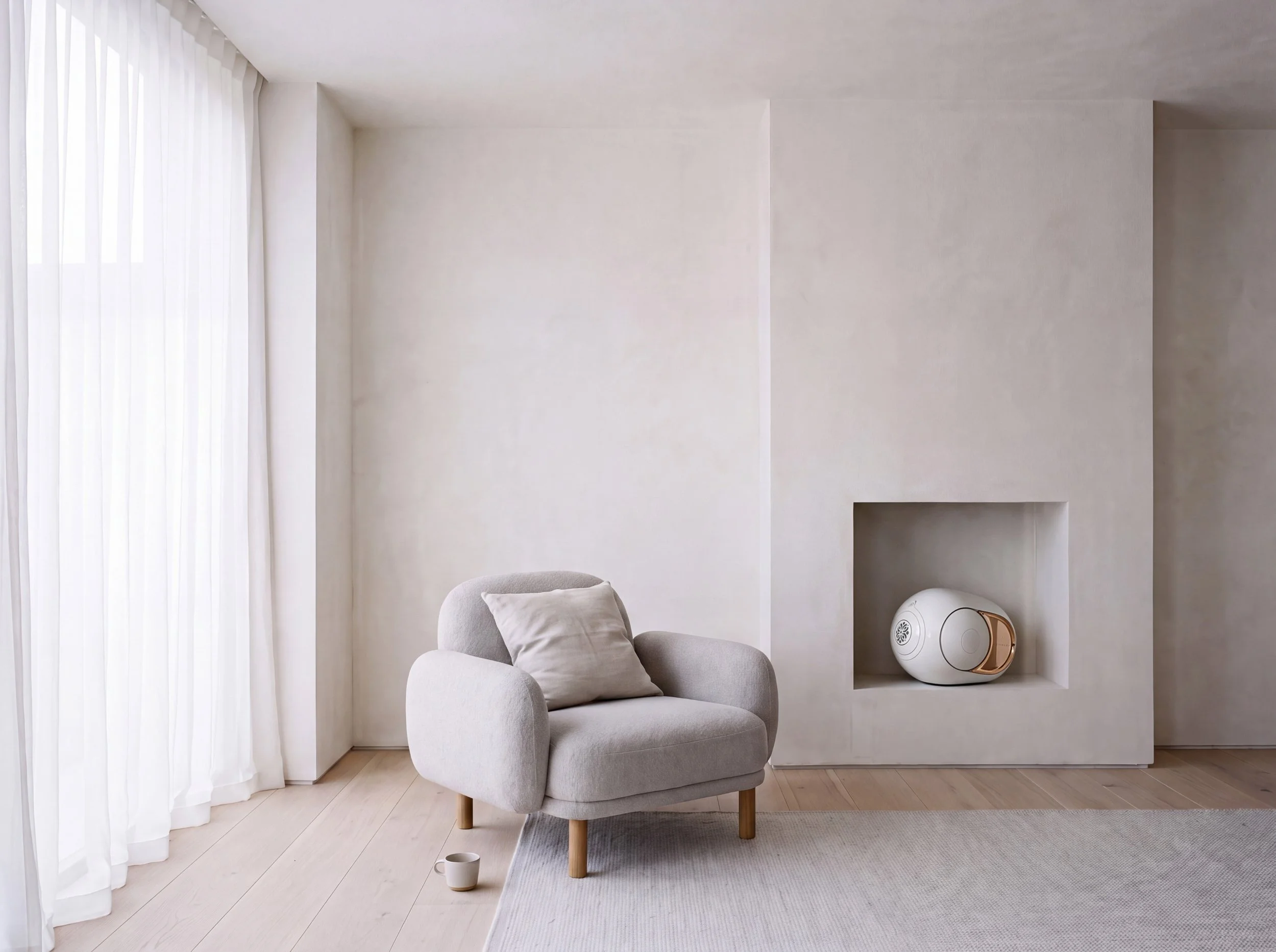
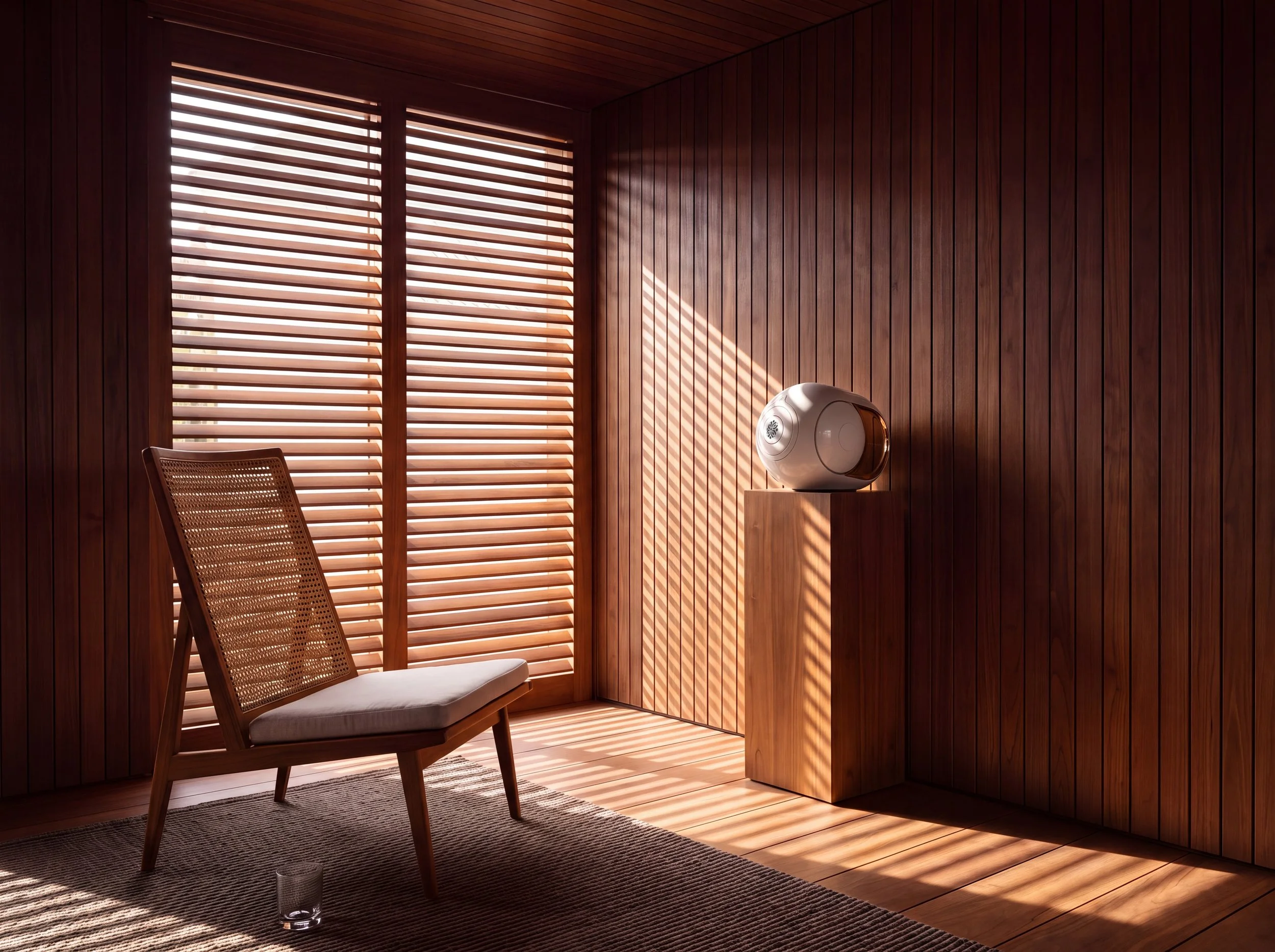
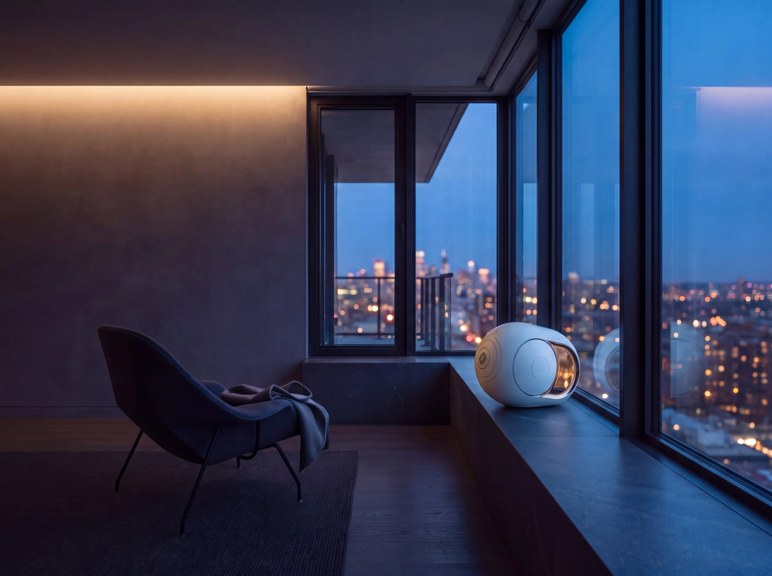
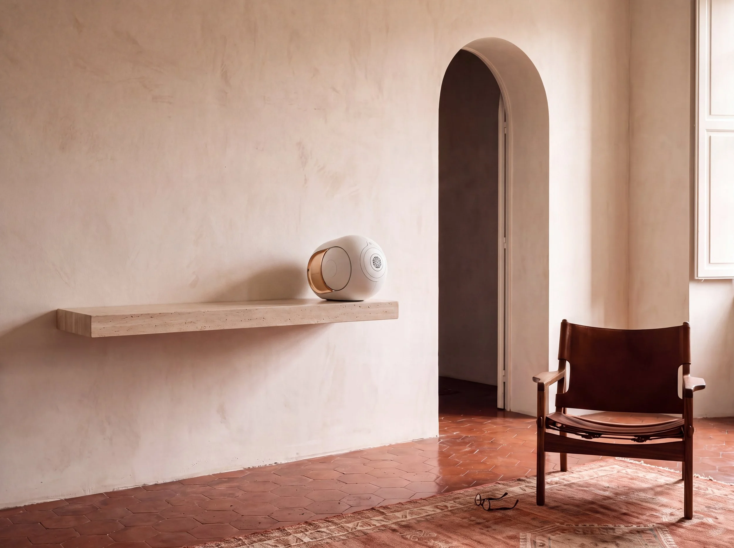
Phantom: A room-by-room test of whether a real object can survive an invented house.
The Devialet Phantom is a real product with real proportions, and most image models render it as a white sphere with a brass disc stuck to the side. The exercise was never to invent a speaker — it was to put an existing one into rooms that don't exist, at the right size, in light that behaves.
The rule: the speaker sits on the building, never on the furniture.
Five surfaces across five rooms, and not one of them is a table. A cantilevered concrete plinth, a plaster niche, a teak pedestal, a stone sill, a travertine console. Architecture holds the product; furniture holds the person, and the two never swap roles.
Five rooms, ordered by the quality of light rather than by geography — each one posing a different problem for a white ovoid with two polished domes:
Board-formed concrete.
The plinth sits in shadow; the speaker is lit entirely by sun bouncing off the polished floor. Nothing touches it directly.
Lime plaster, no shadow.
A white object on a white wall in flat light, with nothing to separate them. A recessed niche gives it an edge to read against.
Teak, through slats.
Bars of light cross the pedestal, the speaker, and the wall as one continuous event, bowing with the curve of the body.
Glass, stone, city.
Cool dusk from the window on one side, warm light from the room on the other, meeting down the middle of the form — the only frame where the speaker glows from within rather than reflecting what's around it.
Limewash and travertine.
The quiet one. Separation comes from material, not light — a machined white surface against a hand-troweled wall.
Extended to motion.
The same system, moved. And a new failure mode that didn't show up in stills: close on the Phantom, and the details start to drift — the seam between the domes, the texture of the grille, the exact curve of the body. Distance was the fix, not detail. Frame the speaker the way you'd frame it in a photograph meant to be looked at from across the room, not examined up close, and the object holds. Move in for the kind of intimacy video usually wants, and it stops being the Phantom.
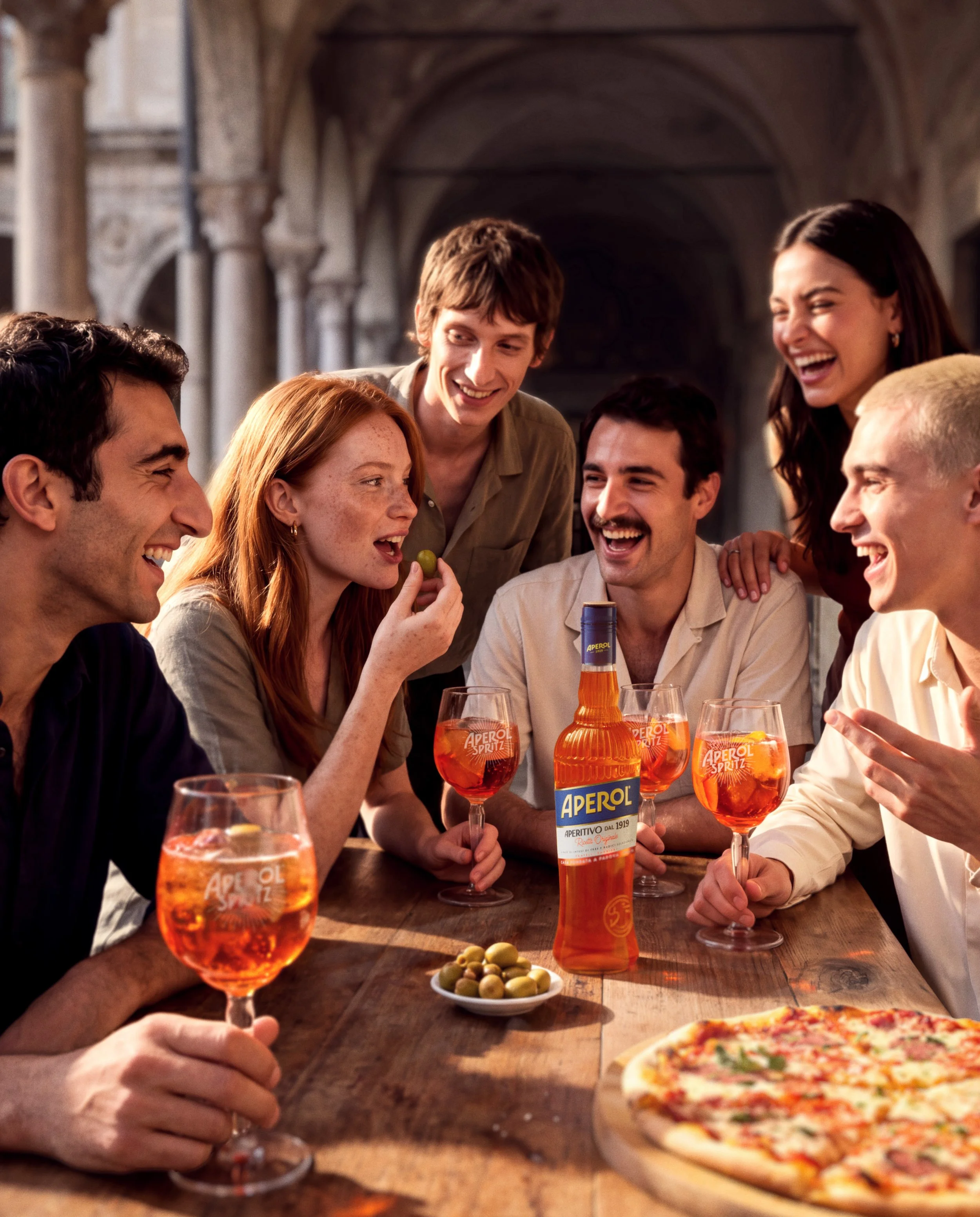
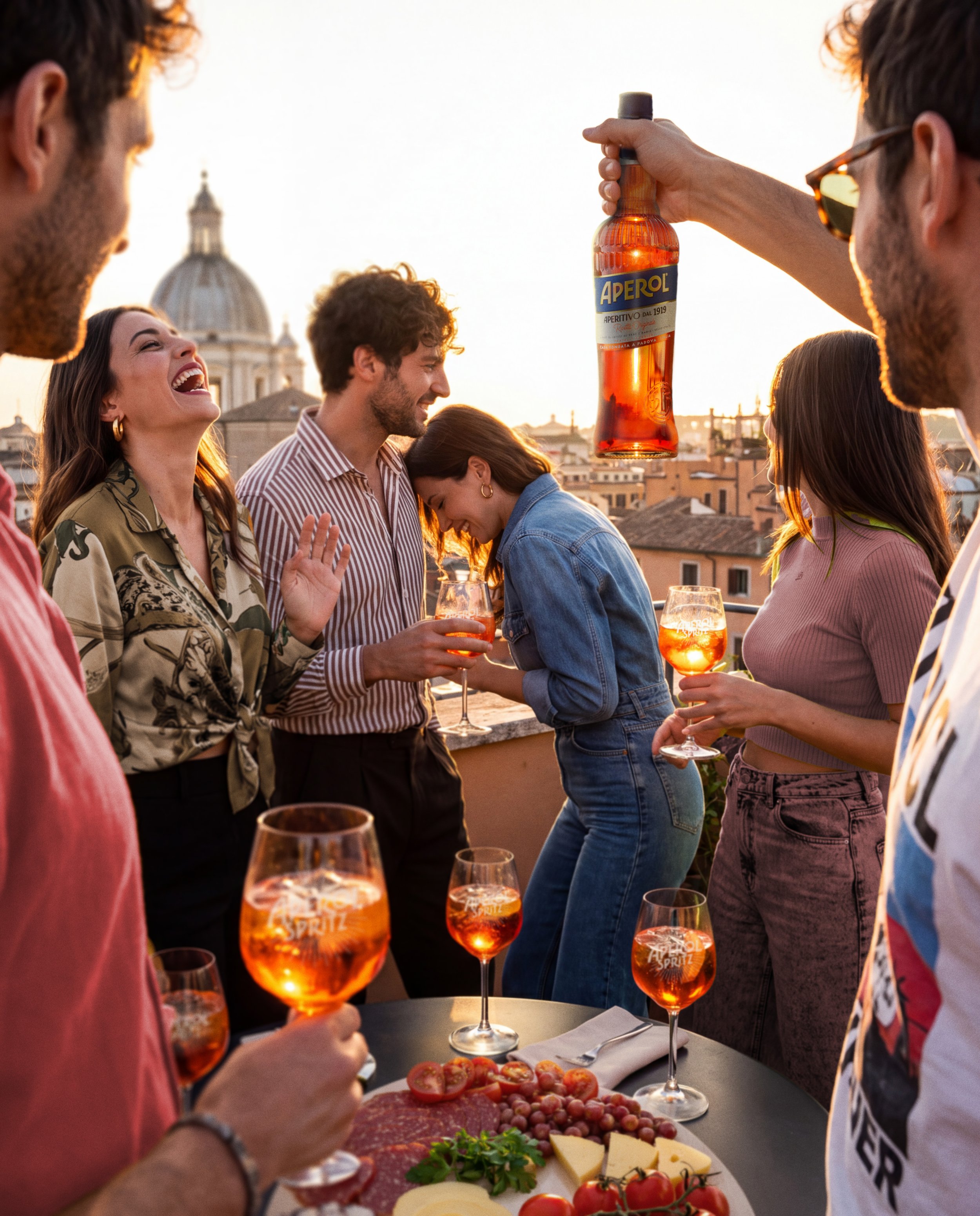
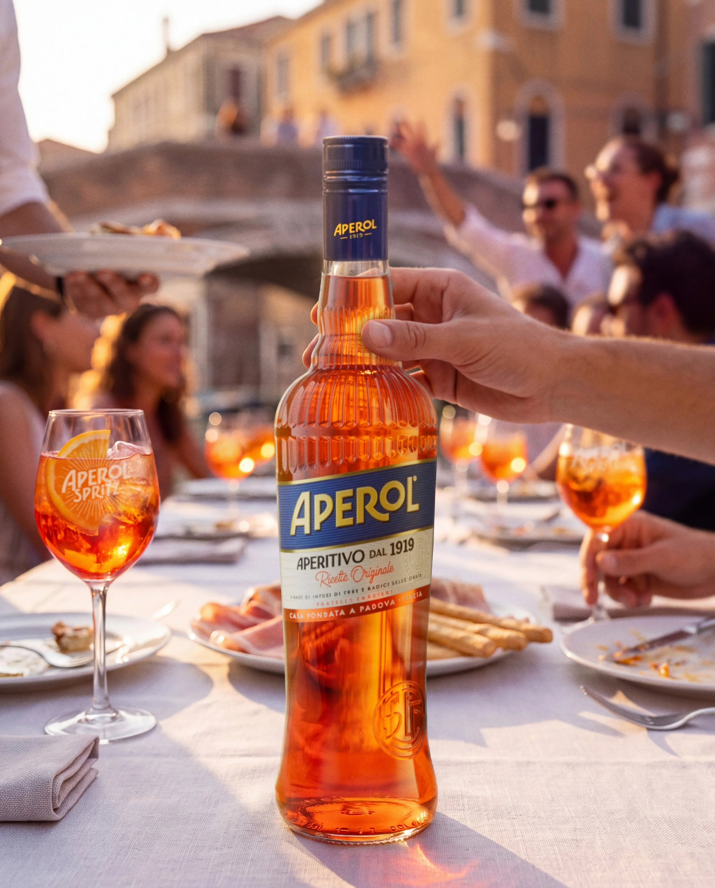
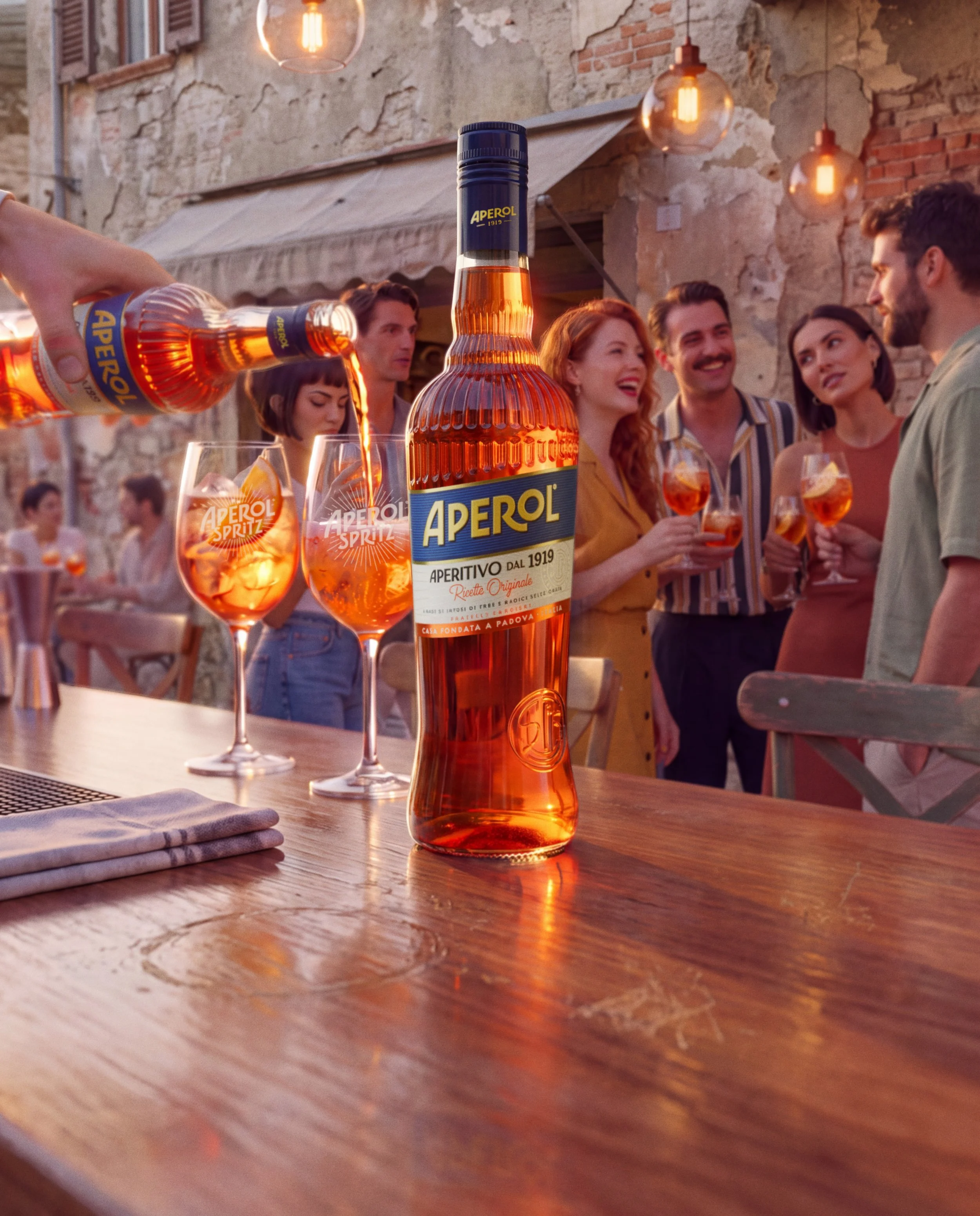
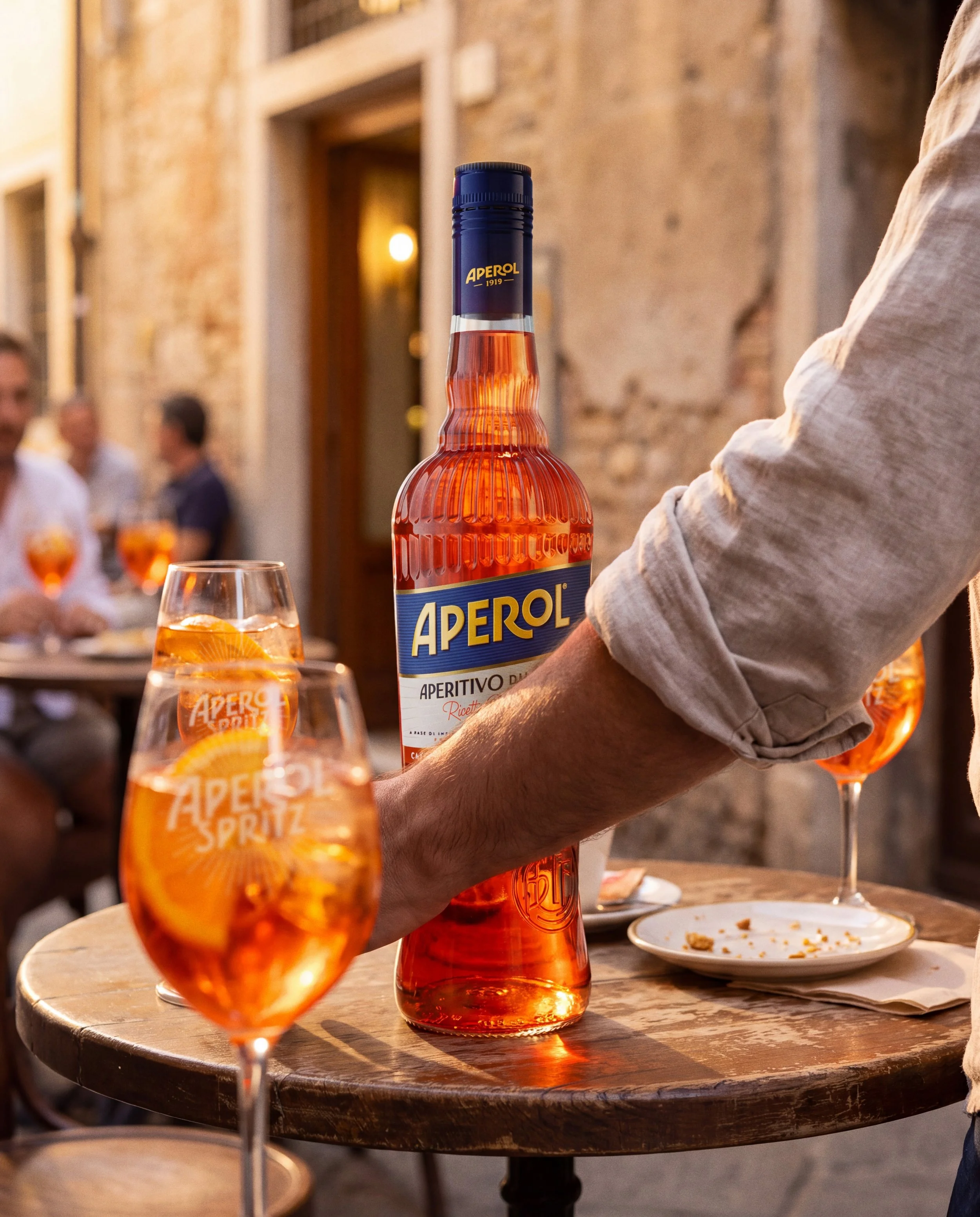
Aperol: A campaign built on the bottle, for a brand that only ever shows the glass.
The drink is famous. The bottle isn't. Aperol's own advertising made the spritz a global default — ordered by name in bars where the bottle is never seen. This spec campaign inverts that: five executions with the bottle as hero, on the premise that the brand's most recognizable object is also its least used one.
The rule: one label asset, locked before the first frame, never redrawn to suit a scene.
Reconstructed from public label photography, corrected for perspective and lighting, then fixed. When a scene demanded a change to the artwork, the scene changed instead — not the label.
Five scenes, five Italian cities, each one chosen to break the label in a different way:
Front-lit, direct — Cloister, Bologna.
The baseline: label flat, fully lit, unobstructed. The easiest condition in the set, and the one that took the most attempts to get right.
Backlit through liquid — Rooftop, Rome.
The bottle raised between sun and camera, the label read against its own transmitted glow. The hardest tonal relationship in the set.
Raking sidelight — Canal terrace, Venice.
Hard low sun across the bottle's face. The label wraps the curve and foreshortens toward the shadowed edge — the condition where type geometry either holds or visibly fails.
Reflection — Village bar, Tuscany.
The artwork appears three times in one frame: standing, pouring, and inverted in the polished wood beneath. Three simultaneous tests, one locked asset.
Partial occlusion — Street cafe, Siena.
An arm across the bottle, a glass in front of it. The label is legible only in fragments — the set ends with it mostly hidden and still unmistakable.
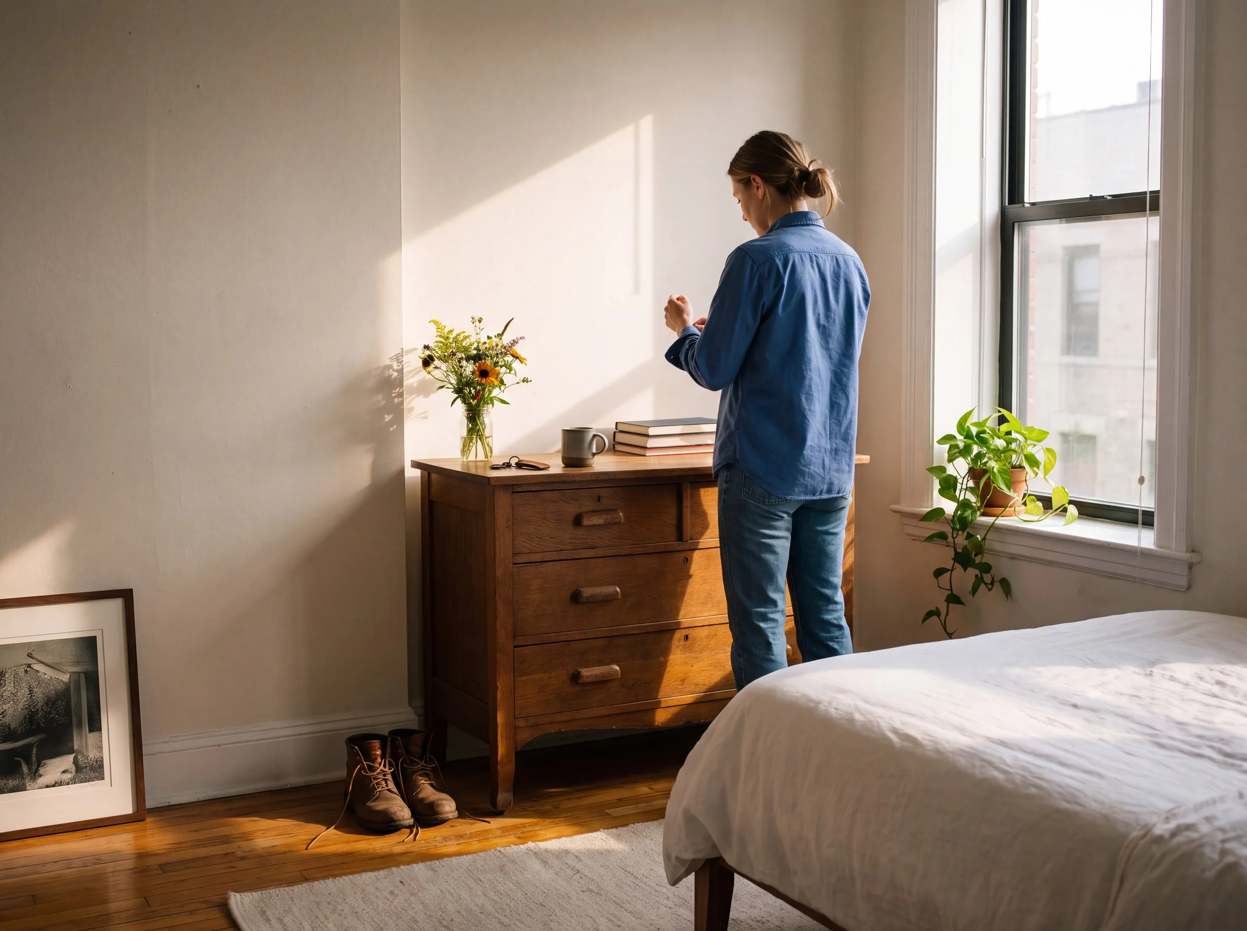



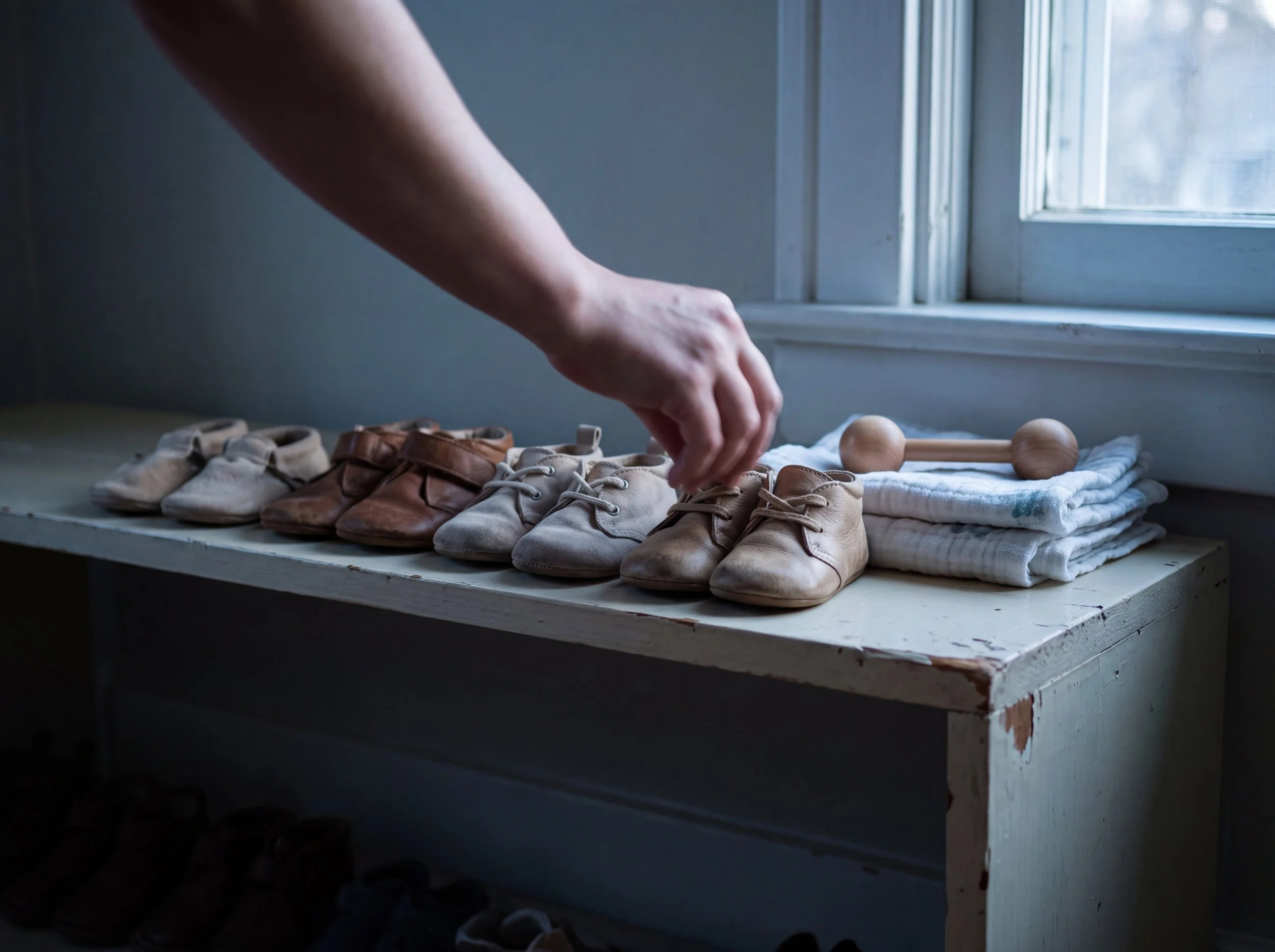
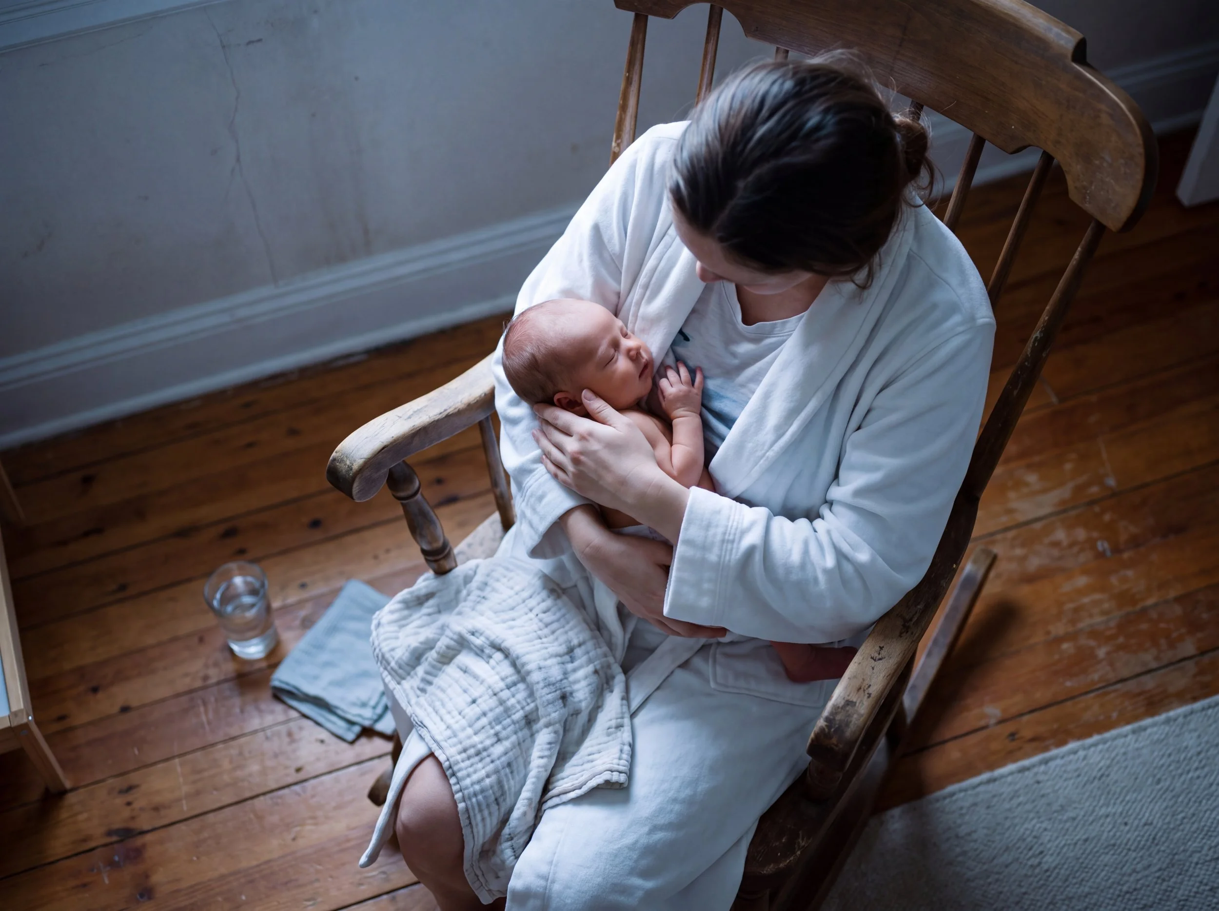
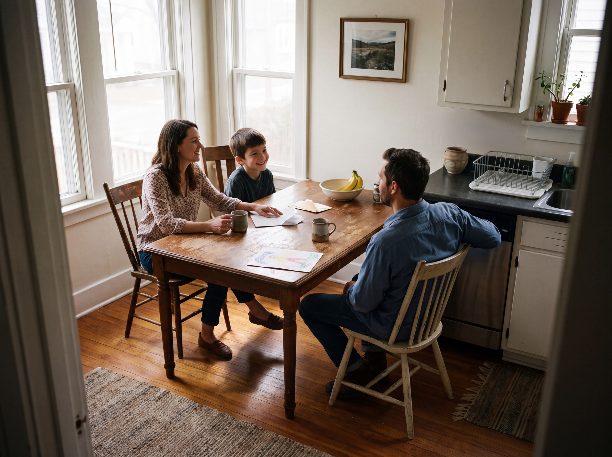
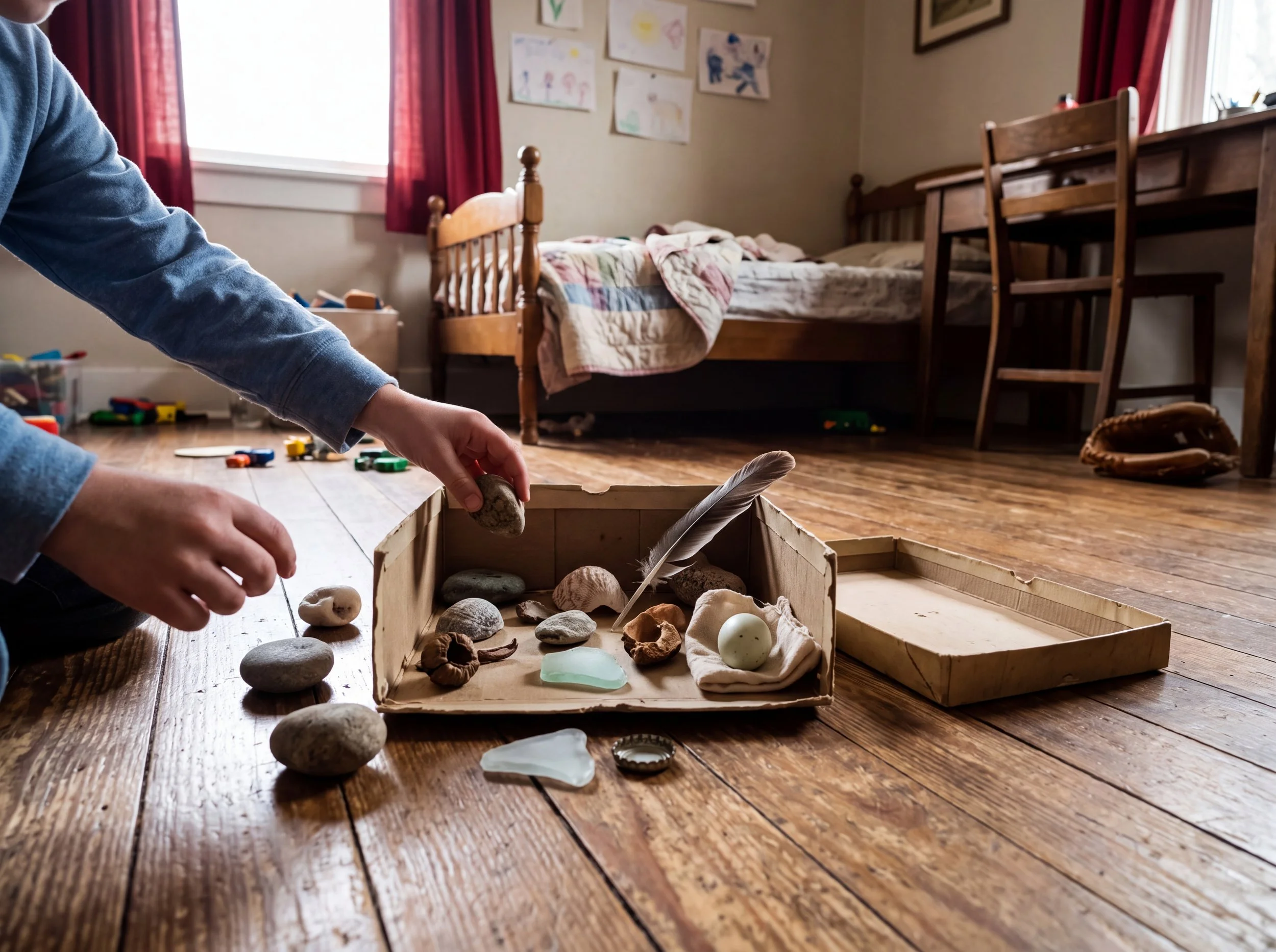
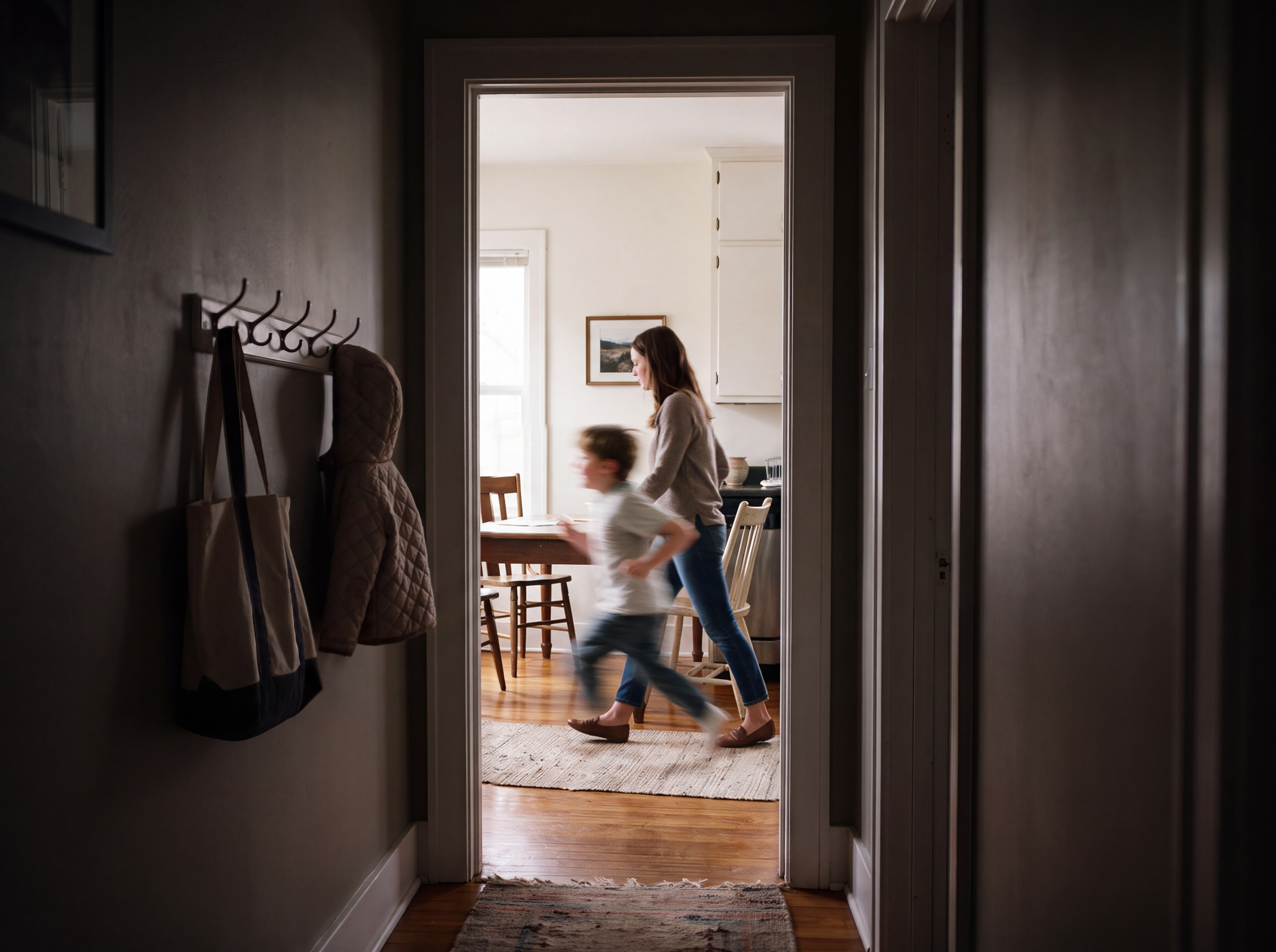

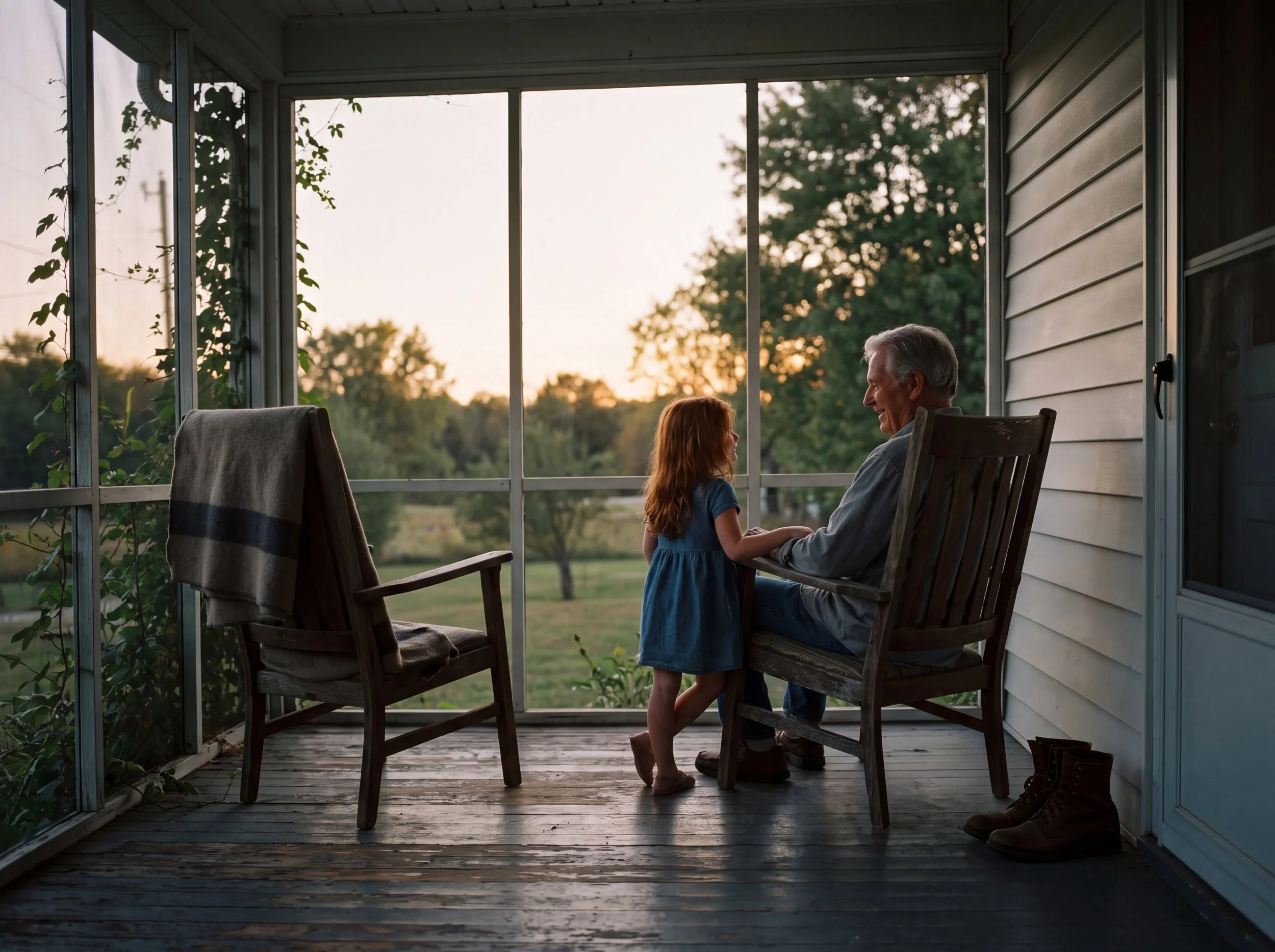
Alere: A visual system for a bank that measures a life, not a balance.
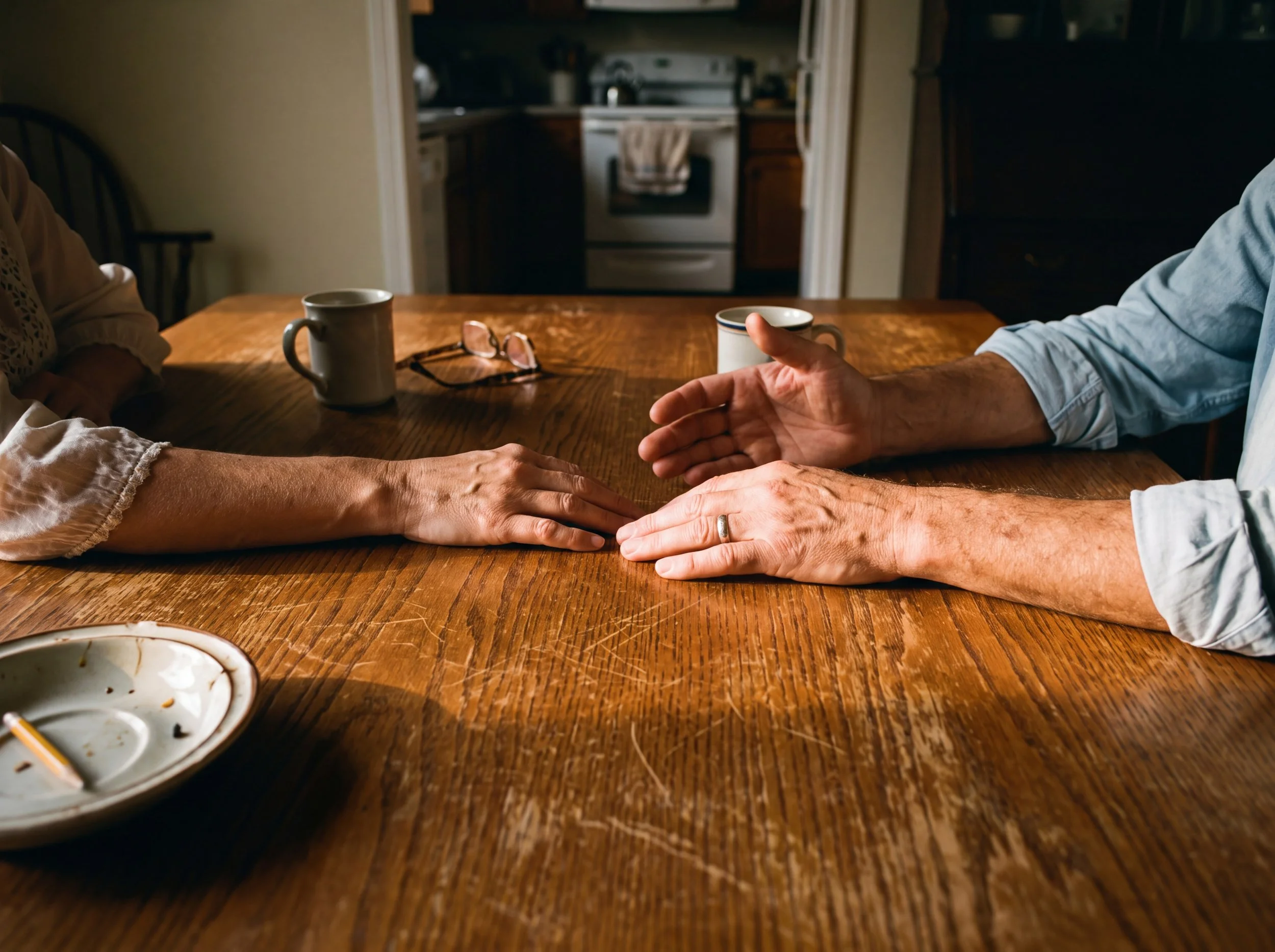
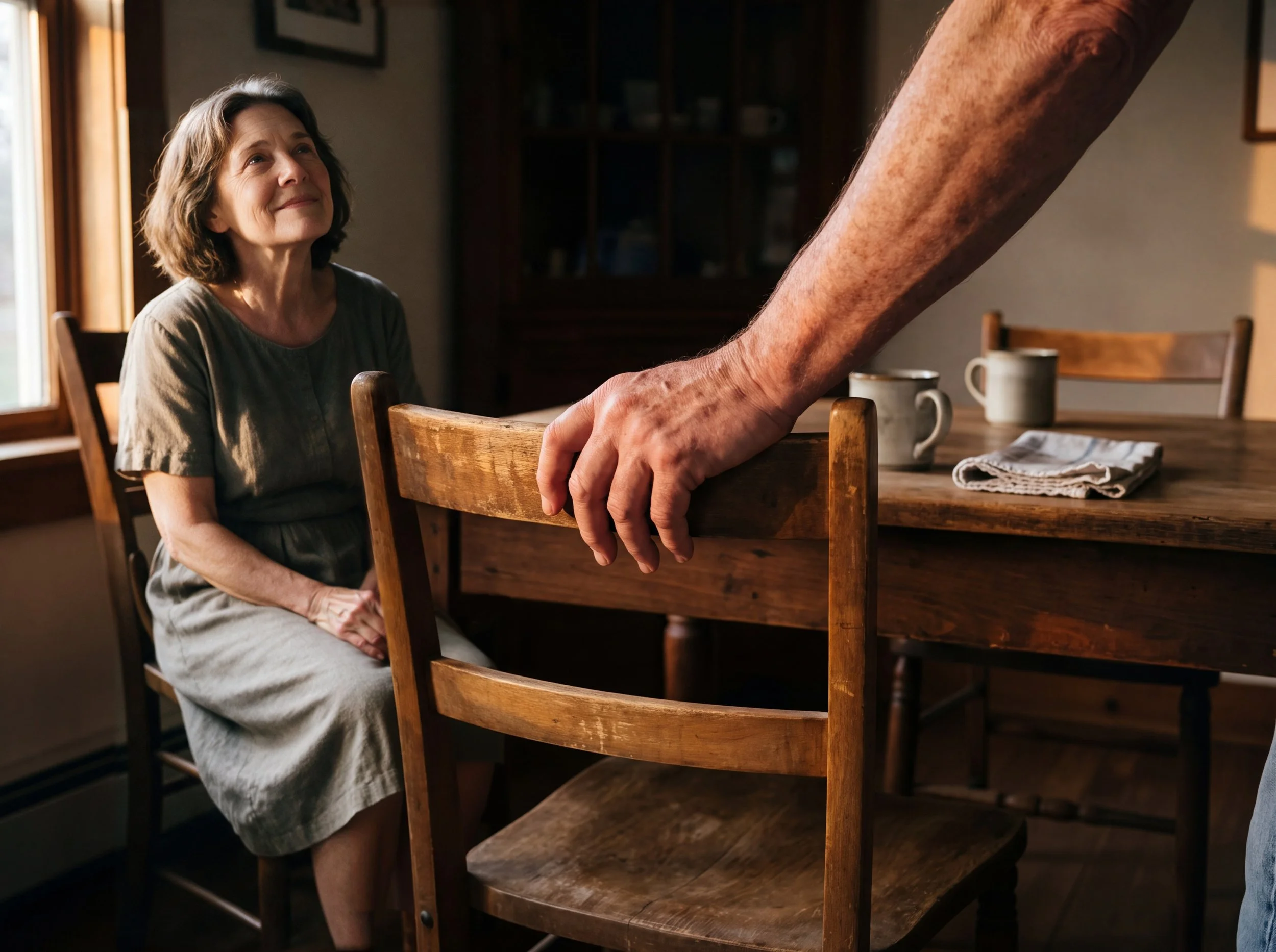
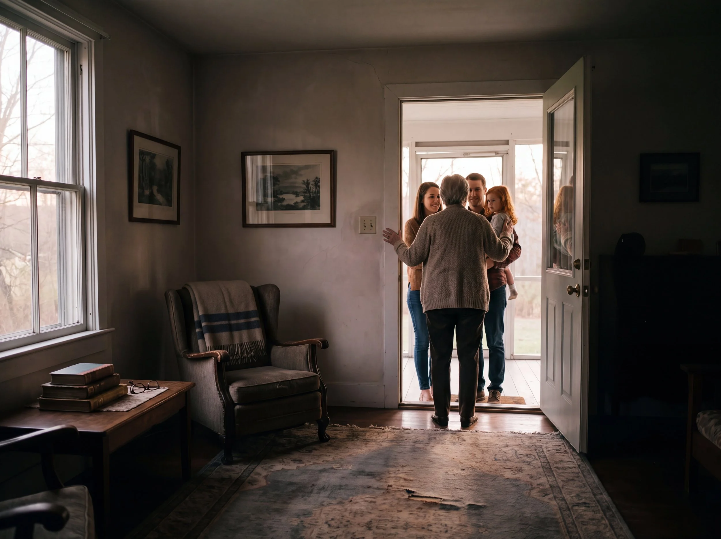
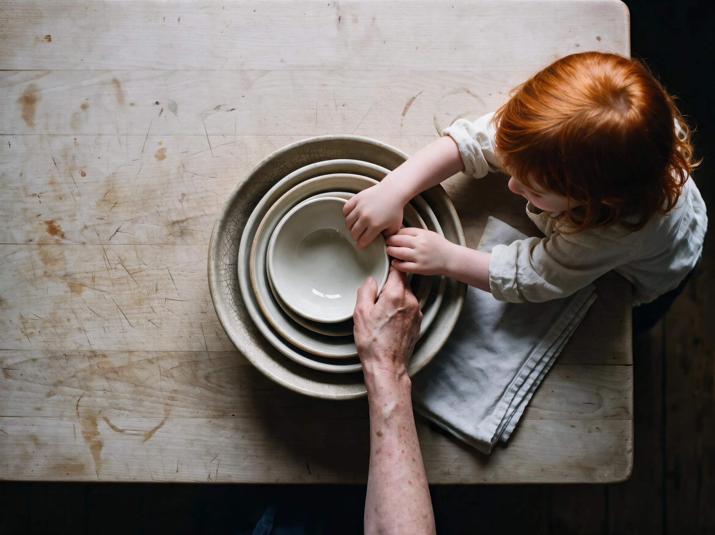
Alere is a fictional bank built on a single idea: an institution that warns you before you take on too much debt instead of selling you more of it, and advises by stage of life rather than by product. The category is visually interchangeable — every competitor shoots the same bright kitchen, the same couple at the same laptop. So the brand couldn't be built in the subject matter. It had to be built in the treatment.
The rule: every image is lit by available, real light, in a real room where the customer actually lives.
One window, one direction, no studio, no fill. Shadows fall where they fall. Color comes only from what's physically in the room. The bank never appears in its own advertising — only the life it exists to support.
Fifteen images across five stages of one life, the hour of day carrying the stage, so the set reads as a single day standing in for a lifetime:
First job, first apartment — 7:15am.
A borrowed space, a jar of change on the sill. The light is generous; the possessions are few.
A child arrives — 5:20am.
The only cool hour in the set — pre-dawn, before anything is switched on.
A household, mid-career — 12:40pm.
The fullest hour, and the only row where the whole household shares a frame.
Before retirement — 5:10pm.
Late sun, deep shade — the most shadowed room in the library. Two pairs of hands that have been on the same table for forty years.
Retirement — 7:40pm.
Dusk. Every frame now holds more than one person. The set ends looking outward rather than in.
Extended to motion.
Every frame in this set holds a hand — settling a stack of coins, turning a cup, steadying a chair. The image logic transferred cleanly. The motion didn't. I could picture exactly how a hand should move through a gesture like that, but knowing the motion and describing it precisely enough for the model to produce it turned out to be two different skills. Vague direction produced strange, physically wrong results — hands that moved correctly in general but not in the specific, grounded way an actual hand does. The fix was the same discipline as everything else in this set: get specific about the mechanics, not just the mood. Naming the motion in physical terms, not emotional ones, was what finally closed the gap between what I saw in my head and what came out.


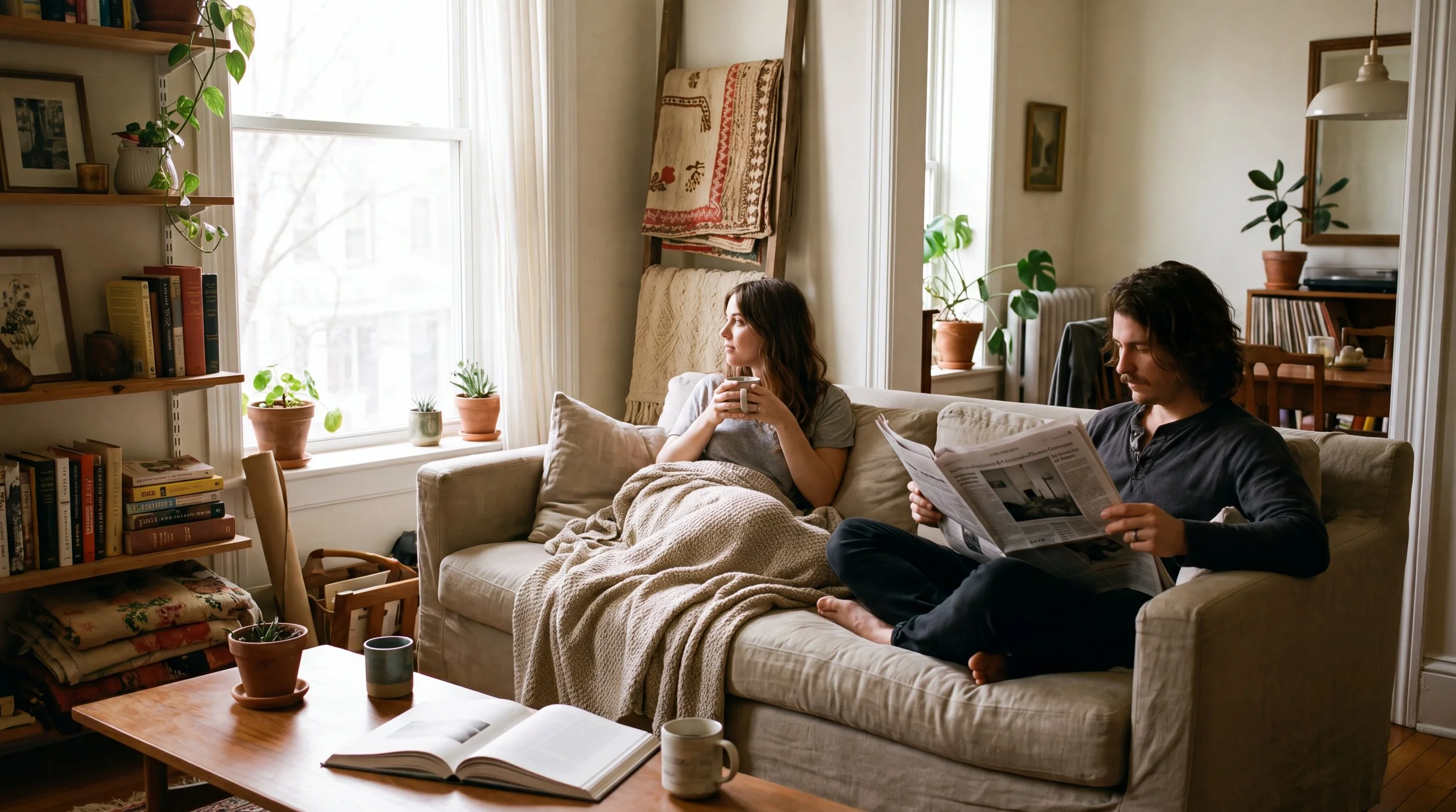
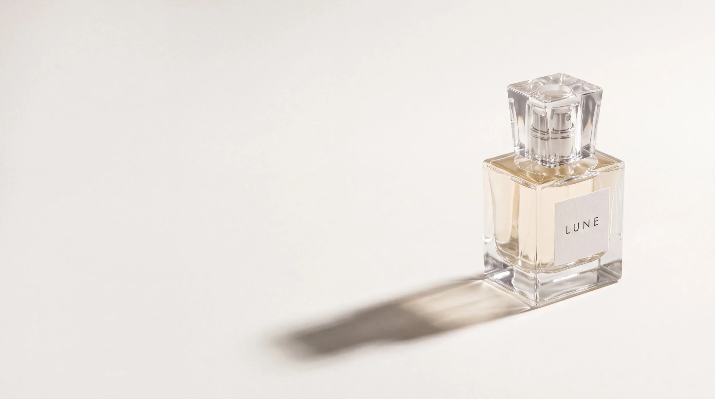


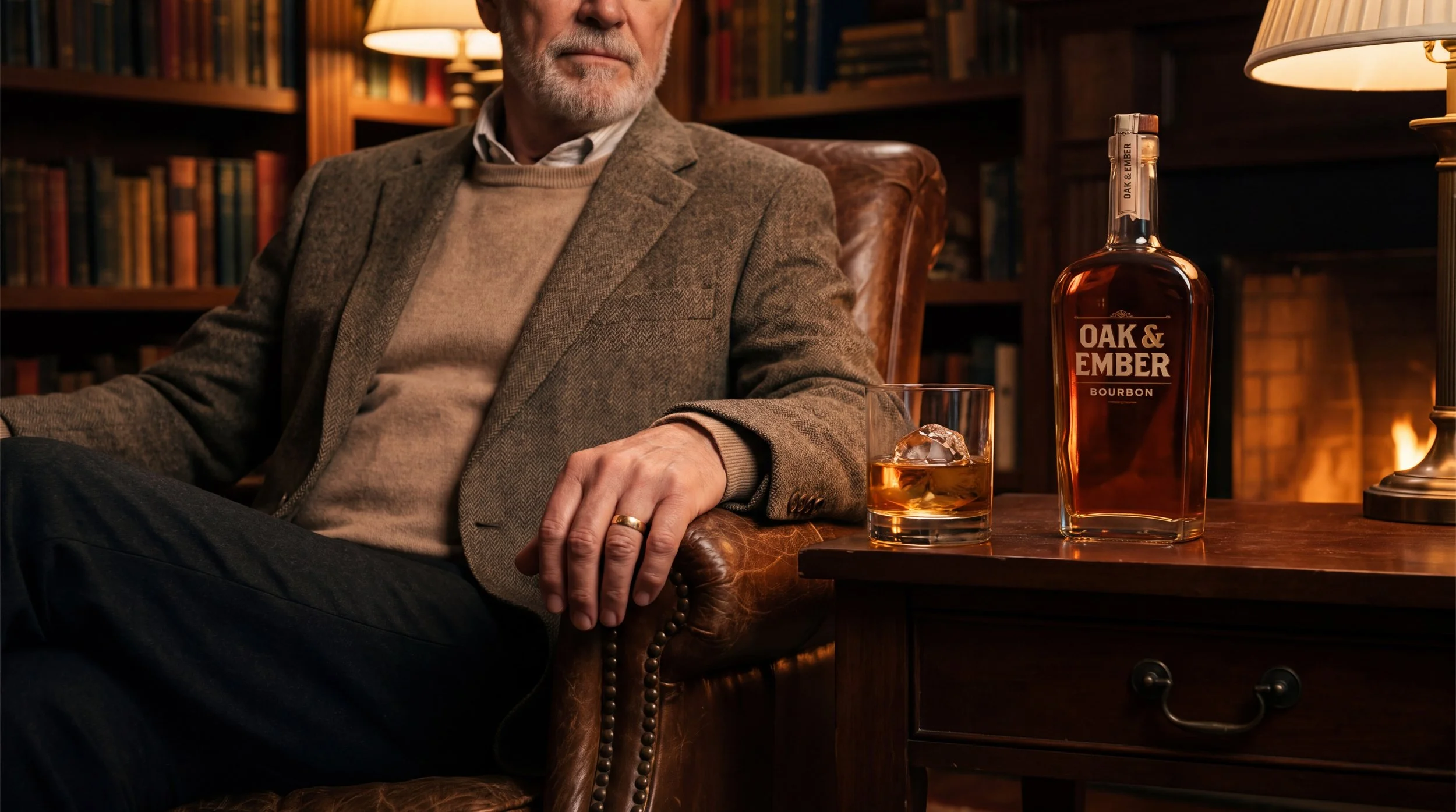

One Hero, Eight Industries: A study in landing-page hero imagery — one clear focal point, a tight palette, and deliberate composition, adapted to whatever mood the brand calls for.
Every image follows the same rule set: one hero, a tight two-to-three color palette, deliberate composition, nothing accidental in frame. The point isn't repetition — it's proving the discipline travels. Beauty, fashion, finance, and fitness each get their own mood and grade, some quiet, some dramatic, but the same eye is behind all eight..
Electronics & tech. Private stillness inside a crowded city — sound as sanctuary.
Fashion. Stark and direct — a deliberate, disciplined kind of style.
Furniture & home. A real living room. Real clutter. Real life together.
Beauty & fragrance. One bottle, one shadow, and room enough to breathe.
Fitness & athletic. Mid-effort, sweat and focus — nothing performed for the camera.
Finance & corporate. A calm hand in a moving room — precision amid motion.
Beverage. Warmth, wood, and a slow evening — the mood of the room does the work.
Home wellness. A ceremonial pour — steam, spotlight, and a single warm gesture.
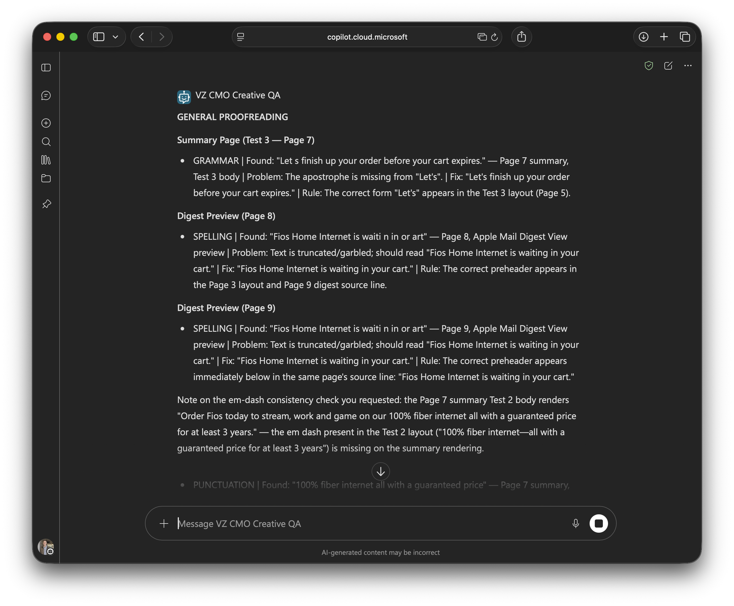
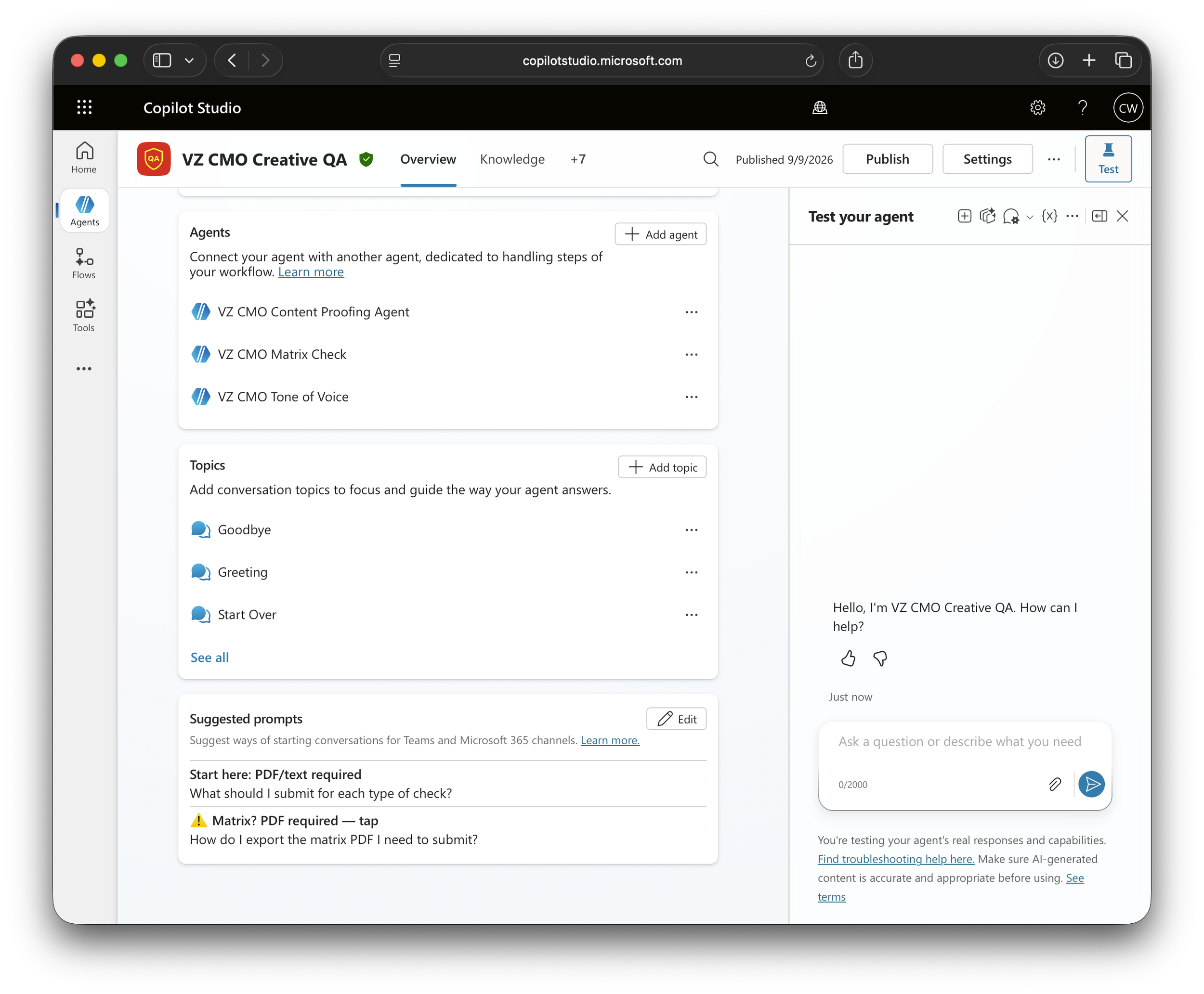
Creative QA Agent: 8 months to find the right approach. 10 days to build it.
When proofreading moved off our team, the work didn't. Verizon email creative is detail-critical — a missed typo, a price that doesn't match the copy deck, a headline that differs between desktop and mobile all still had to be caught, just without a proofreading department to catch it. What looked like one job was actually four: spelling and grammar, Verizon-specific voice and tone, desktop-versus-mobile layout parity, and matrix verification — checking the copy deck against what actually shipped. Too much for one agent.
Four approaches, each one narrowing it down.
My first attempt was basic — barely more than a simple prompt — but it taught me the fundamentals of how an agent actually works. It just wasn't built for a task with this many moving parts. Gemini Gems worked well for image prompting and shipped, but the same method failed on proofreading. Commercial tools like Writer and Grammarly could have solved it, but I had a strong preference to build internal. Copilot Studio was the right tool, but access was blocked — the tool I could build with wasn't the tool I could run.
Access came through later, in an email to me and a handful of others, with no explanation of what changed. I never found out why. I just knew I could build now.
The turning point: a character limit forced the right architecture.
I was close to finishing one mega-agent when I hit Copilot Studio's 8,000-character instruction cap. Every capability I added meant compressing everything else. The wall wasn't the obstacle — it was the answer. The fix was one orchestrator routing to three specialists: a content proofing agent, a tone-of-voice agent, and a matrix-check agent for copy parity. Split by task, not by ambition.
What actually took the time wasn't the AI.
Getting files in reliably took days — most formats quietly lost content or crashed. Getting it in front of people so they could actually open it was its own multi-step puzzle. None of it was about the model's intelligence. It was plumbing. One problem I didn't expect: running out of AI credits mid-build and having to stop for a weekend. If AI writes your instructions, AI capacity becomes a project dependency.
It's live, and it catches real things — a dropped apostrophe, a preheader that got truncated in one client but not another, small errors that are easy to miss and expensive to ship.
Where it stands.
Four agents running in Teams today, catching real errors in live work. Next: roll it out to the team and pressure-test it against real deadlines. After that: versions for other lines of business with their own rules.
What transfers:
Let AI write your agent instructions — you iterate faster than you can draft by hand.
Split by task, not by ambition. One agent per job beats one agent for everything.
Budget for plumbing, not prompting. Access and permissions are the real work.
Access is the gate. Eight months of searching, ten days of building once the tool was available.
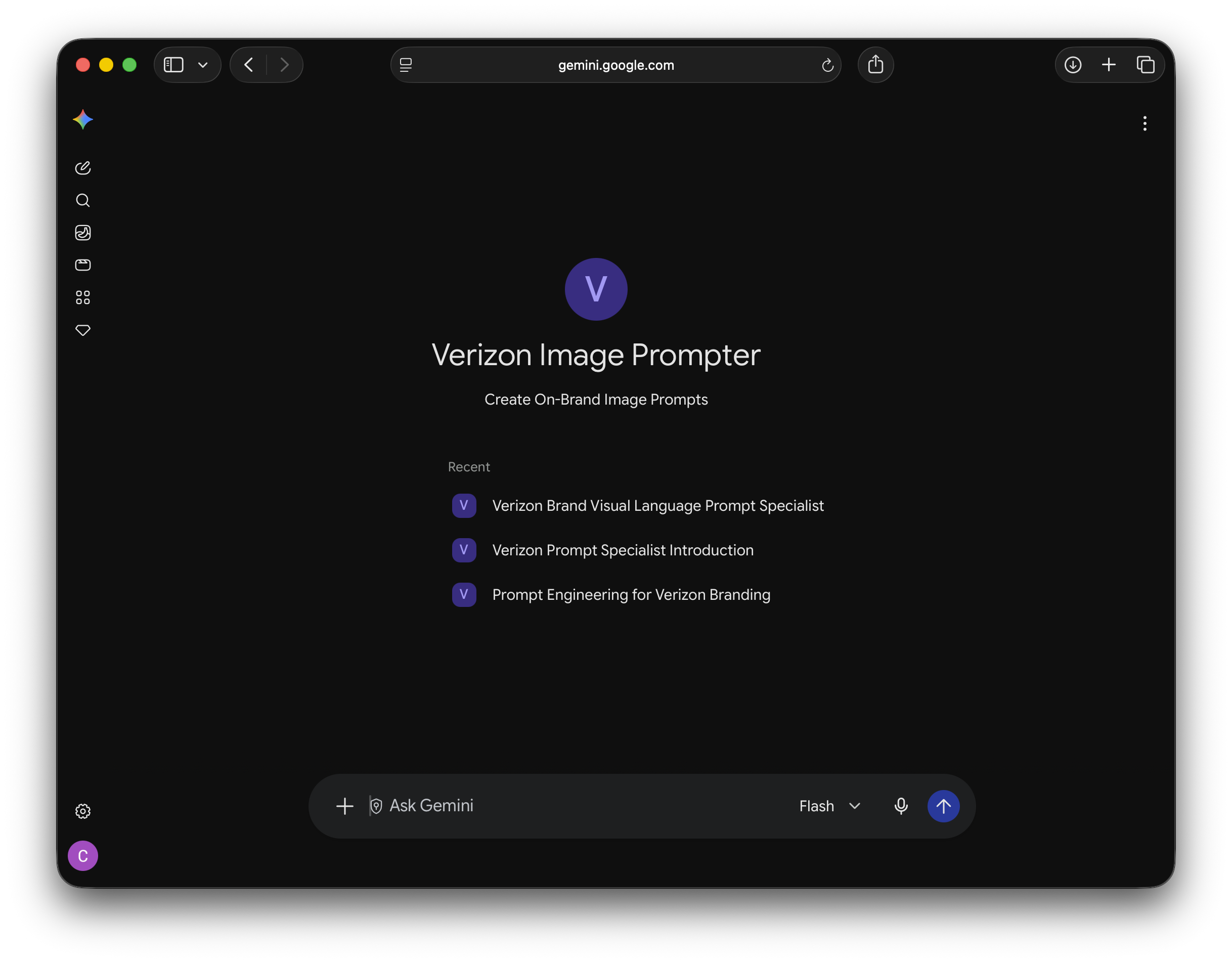
Verizon Image Prompter: The gap between what you want and what a model actually gives you.
Art directors needed to generate on-brand AI imagery, but nobody was going to become a prompt-engineering expert on top of their day job. Ask a model for "Verizon imagery" and you get something generic, or worse, off-brand. The gap wasn't creative judgment, directors have that. It was translation: turning what they wanted into language a model could actually execute. So the brand knowledge went into the agent instead of into their heads.
Teaching it to see like Verizon.
I fed it everything in the Verizon imagery guidelines, plus reference imagery emblematic of the brand, as much descriptive language about how they treat photography as I could gather. The goal was an agent that already knew what "on-brand" looked like, so the director didn't have to carry that knowledge themselves.
The fix was a gate, not a feature.
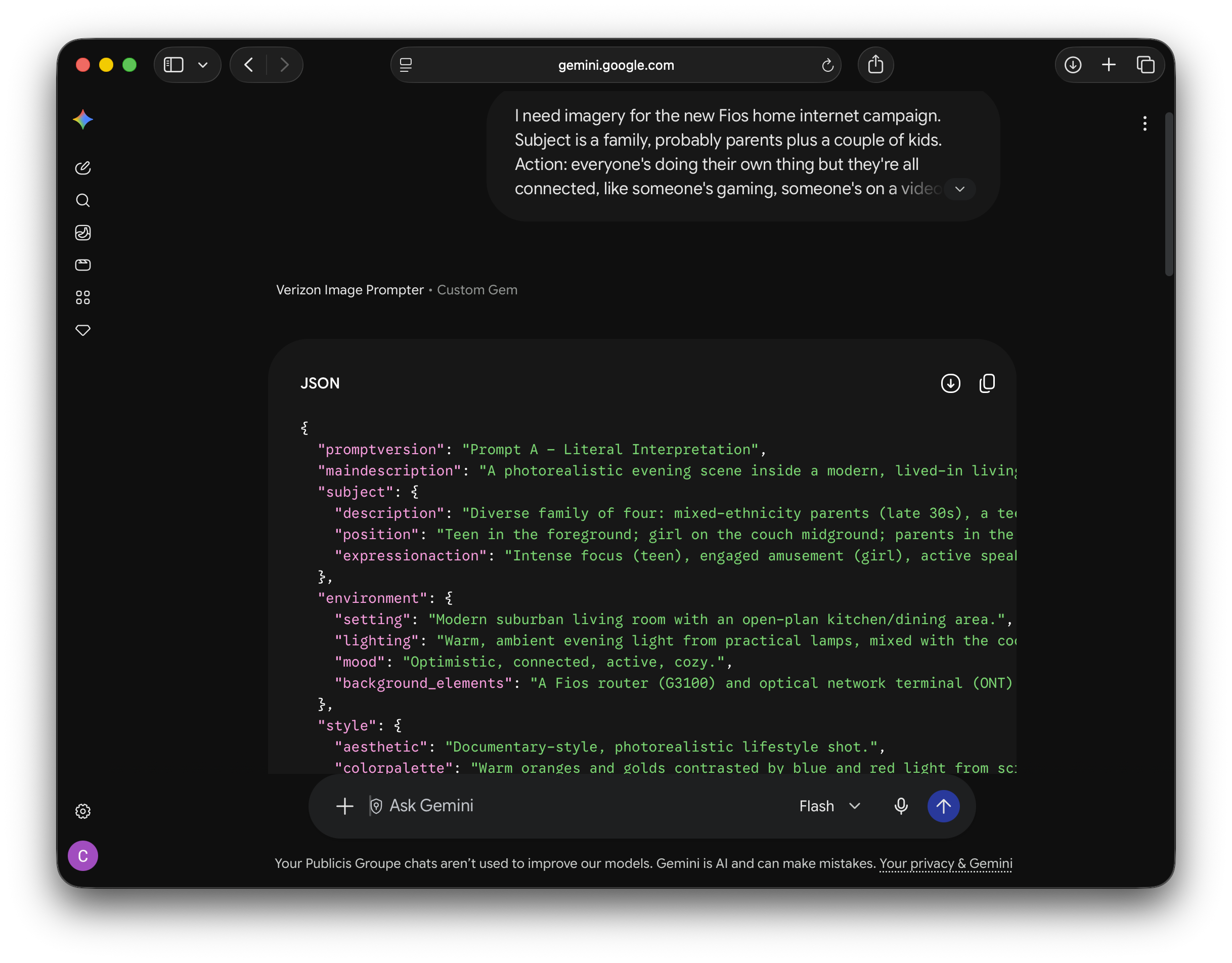
Before it would generate anything, it needed subject, action, and setting, the same basics you'd nail down before a photo shoot. Give it a lazy prompt and it pushed back for more. The point wasn't to slow people down, it was to make sure the failure mode was a director thinking harder, not a bad image going out the door.
Three interpretations, ranked by risk.
Once it had enough, it handed back three prompts: the most literal interpretation, safe and direct; a creative interpretation with artistic flair and unexpected angles; and a premium editorial interpretation, built for maximum production value. Directors picked whichever fit and ran it in their image generation tool of choice. The prompts came back as JSON code blocks, since that's the format image tools actually parse best.
Built as a Gemini Gem, not Copilot Studio.
Where the QA agent needed an orchestrator and three specialists, this one lived and worked well as a single Gem. Different problem, different architecture, one output feeding one decision instead of four parallel checks.
Where it stands.
Verizon's visual direction changed, and the agent's brand knowledge went with it, so it's retired rather than in use. The approach didn't fail, the brand moved. Once the new direction settles, this is a rebuild, not a rethink.
What transfers:
Encode the guidelines, not just the rules. The descriptive language behind a brand's imagery is what a model can actually act on. Gate the input, not just the output. Bad results usually start with incomplete asks. Design the experience, not just the function. The tiered options kept directors exploring instead of settling for the first result. An agent's knowledge has a shelf life. It's only as current as the brand it was built to match.
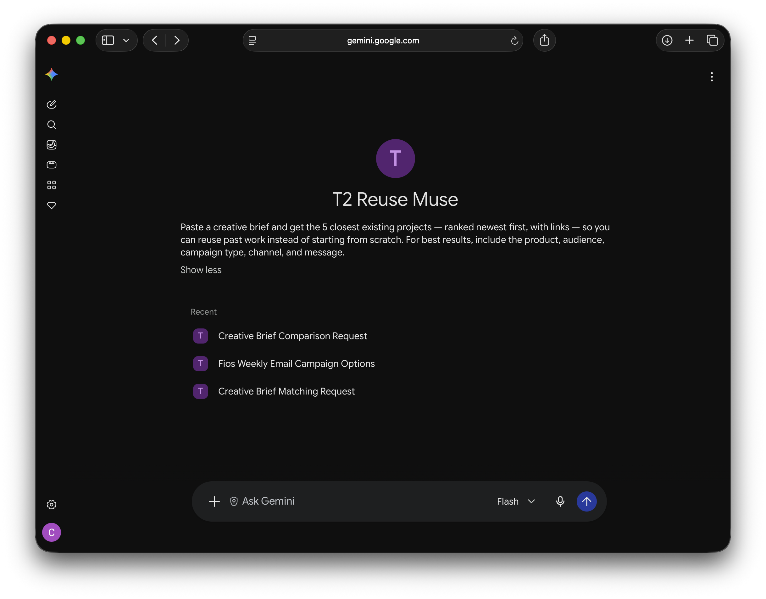
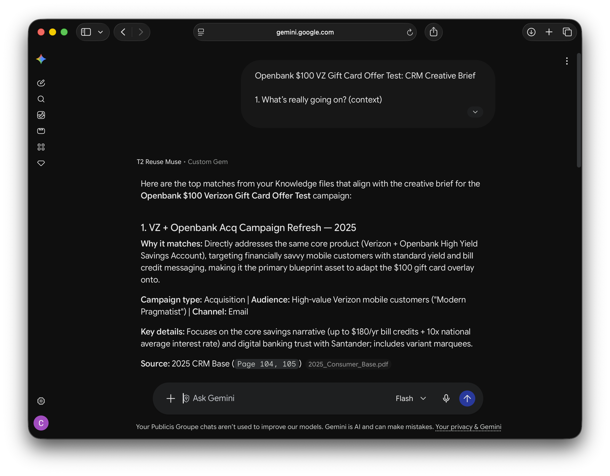
T2 Reuse Muse: Built for clients, which ruled out Copilot Studio before I wrote a line.
Clients would come in with a new brief, and often the answer already existed somewhere in past work, but finding it meant someone manually digging through years of projects. The fix seemed straightforward: build a search agent. The constraint that shaped everything was who'd be using it. Copilot Studio was out from the start, it can't be shared with clients, so whatever I built had to live somewhere client-facing. That left Gemini.
Then the knowledge itself didn't fit.
Gems cap out at 100MB of knowledge, and two years of project work blew past that easily. The fix was splitting the archive into pieces small enough to load, which meant deciding how to divide the work in a way that still let the agent search across all of it coherently, not just within whichever piece a given project happened to land in.
How it works.
A client puts in their brief, and the Gem surfaces similar past projects, prioritized by recency, since newer work needs fewer changes to become the new deliverable. The closer something is to today, the less rebuilding it takes to reuse it.
Where it stands.
Live and in active use.
What transfers:
The audience decides the tool before the task does. Client-facing ruled out Copilot Studio regardless of fit. Knowledge limits are a real constraint, not a rounding error. Two years of work doesn't fit in one Gem; plan for splitting before you start loading. Recency can substitute for relevance ranking. Newest-first was simpler to build than true similarity scoring, and good enough.