Verizon
The Verizon rebrand, before and after. In summer 2024, Verizon relaunched its brand identity with Turner Duckworth. I led the rollout of that identity across acquisition email and direct mail, visually, with a hand in copy as well. It's been one of the more significant things I've worked on, taking a system built for brand campaigns and making it work at the scale and speed CRM demands.
The guidelines we got weren't built for this. Turner Duckworth's system covered the brand world; it didn't answer the hundreds of specific decisions a high-volume acquisition program throws at you every week. So a lot of the system, as it exists in CRM today, got figured out in real time, building the plane while flying it. That's still true. The guidelines keep shifting, and so does the work.
These six pairs show that system next to what came before it.
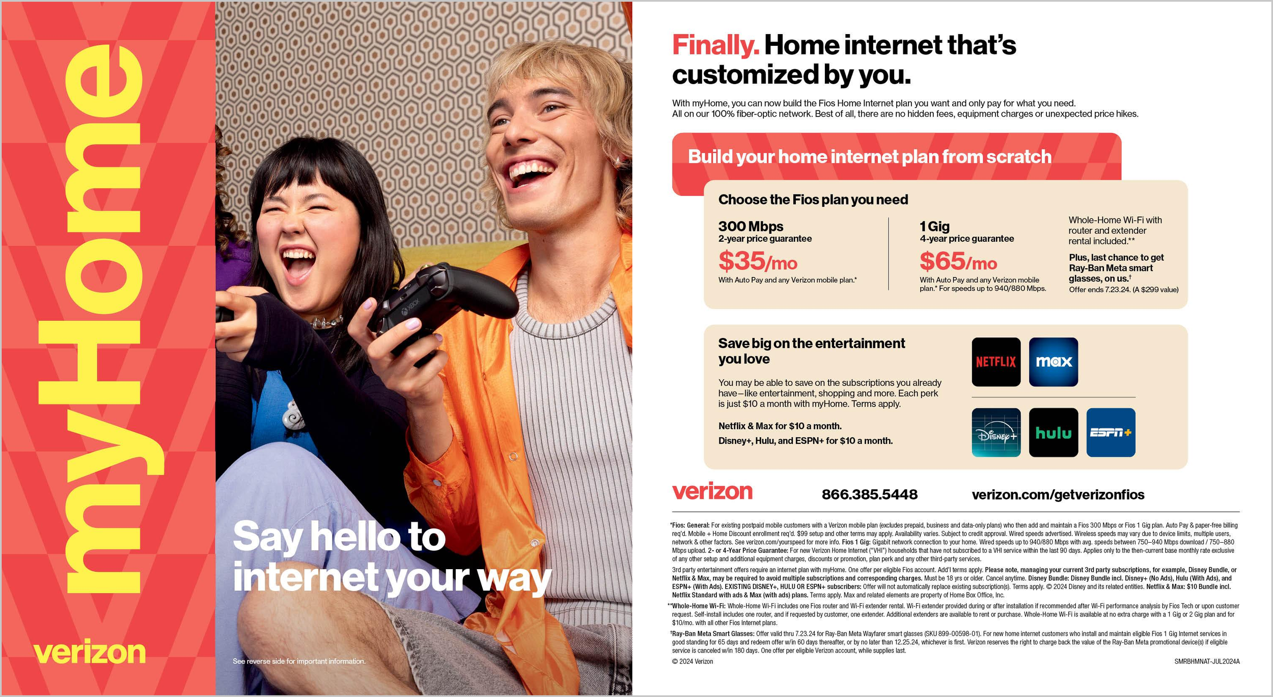
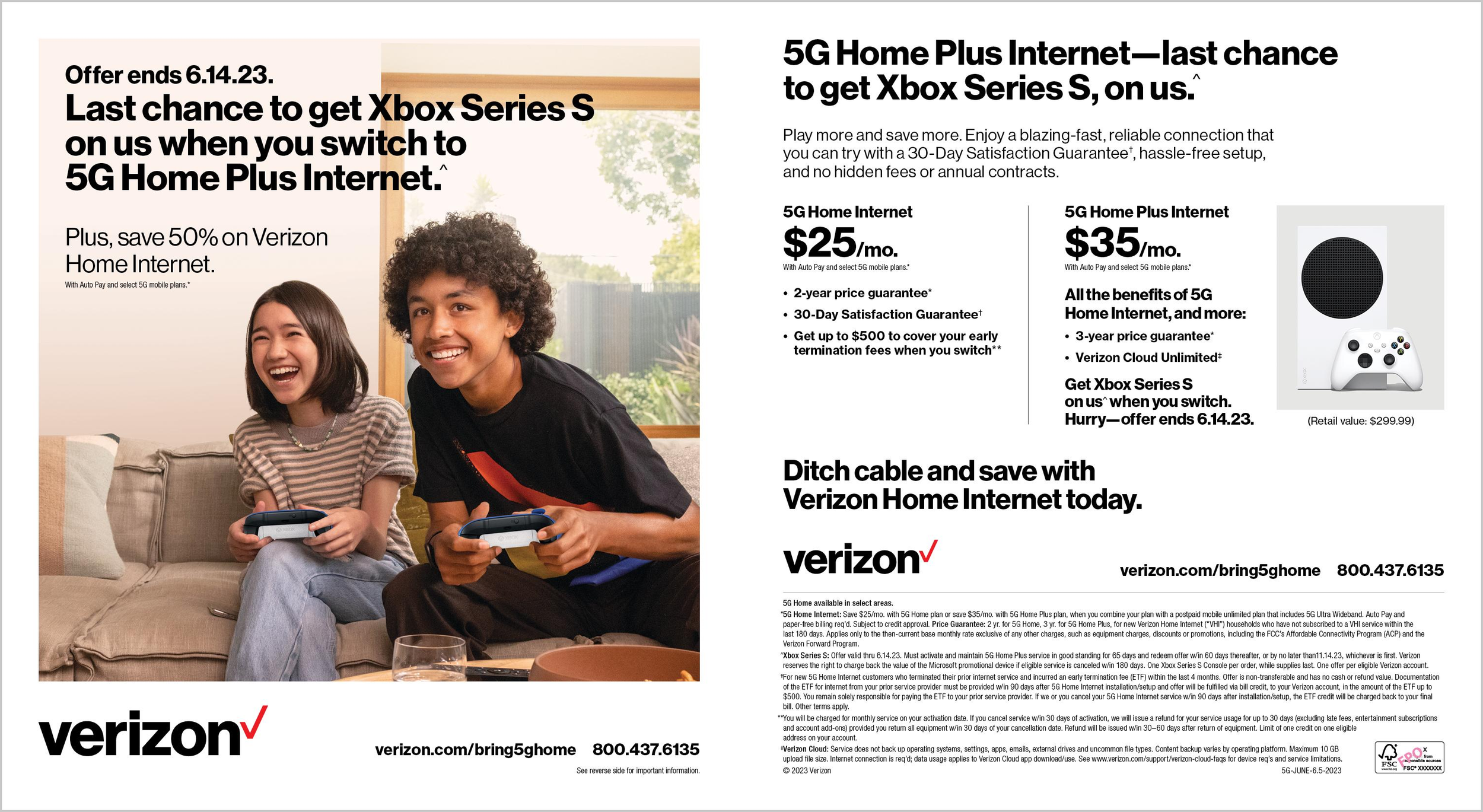
The clearest system change of the six: black Helvetica-weight type on white gives way to a color-driven identity with its own typographic personality, the oversized rotated wordmark doing as much work as the headline.
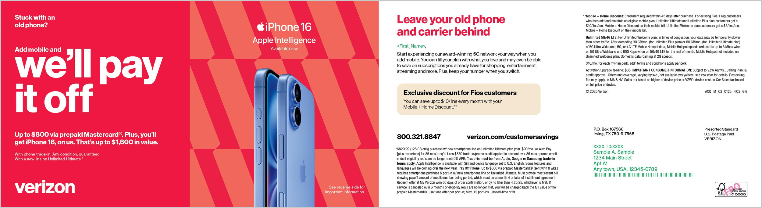
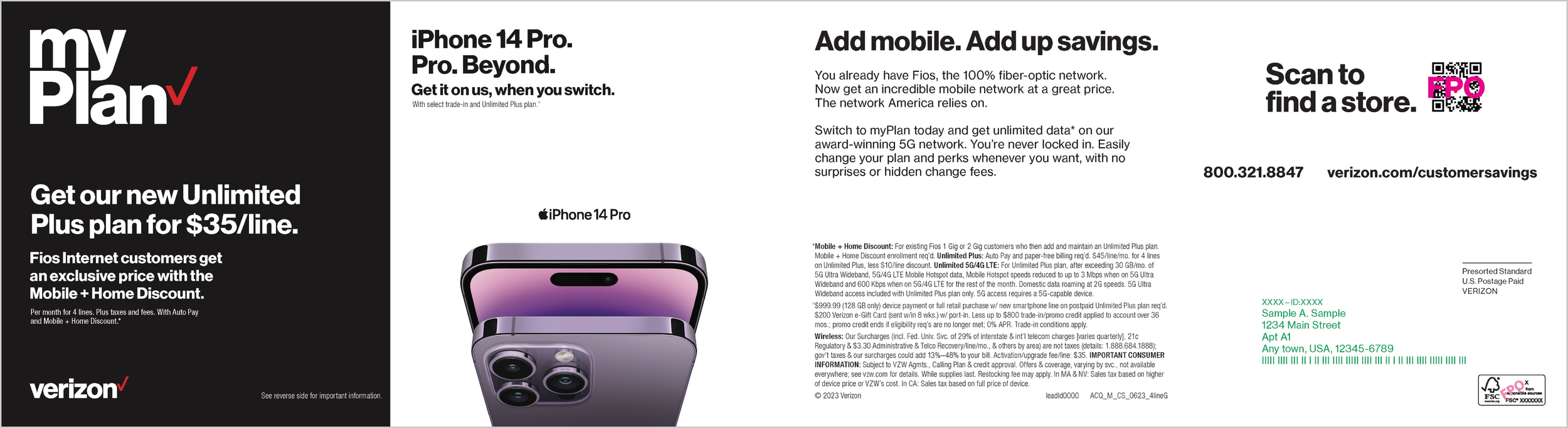
Two mobile device offers, same funnel. The shift here is tonal as much as visual: loud and transactional versus quiet and confident.
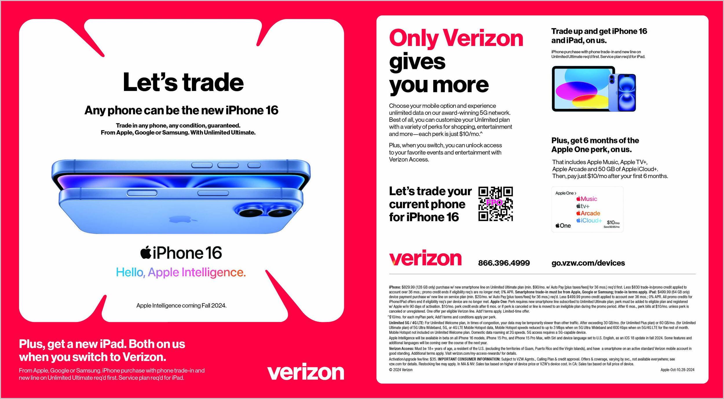
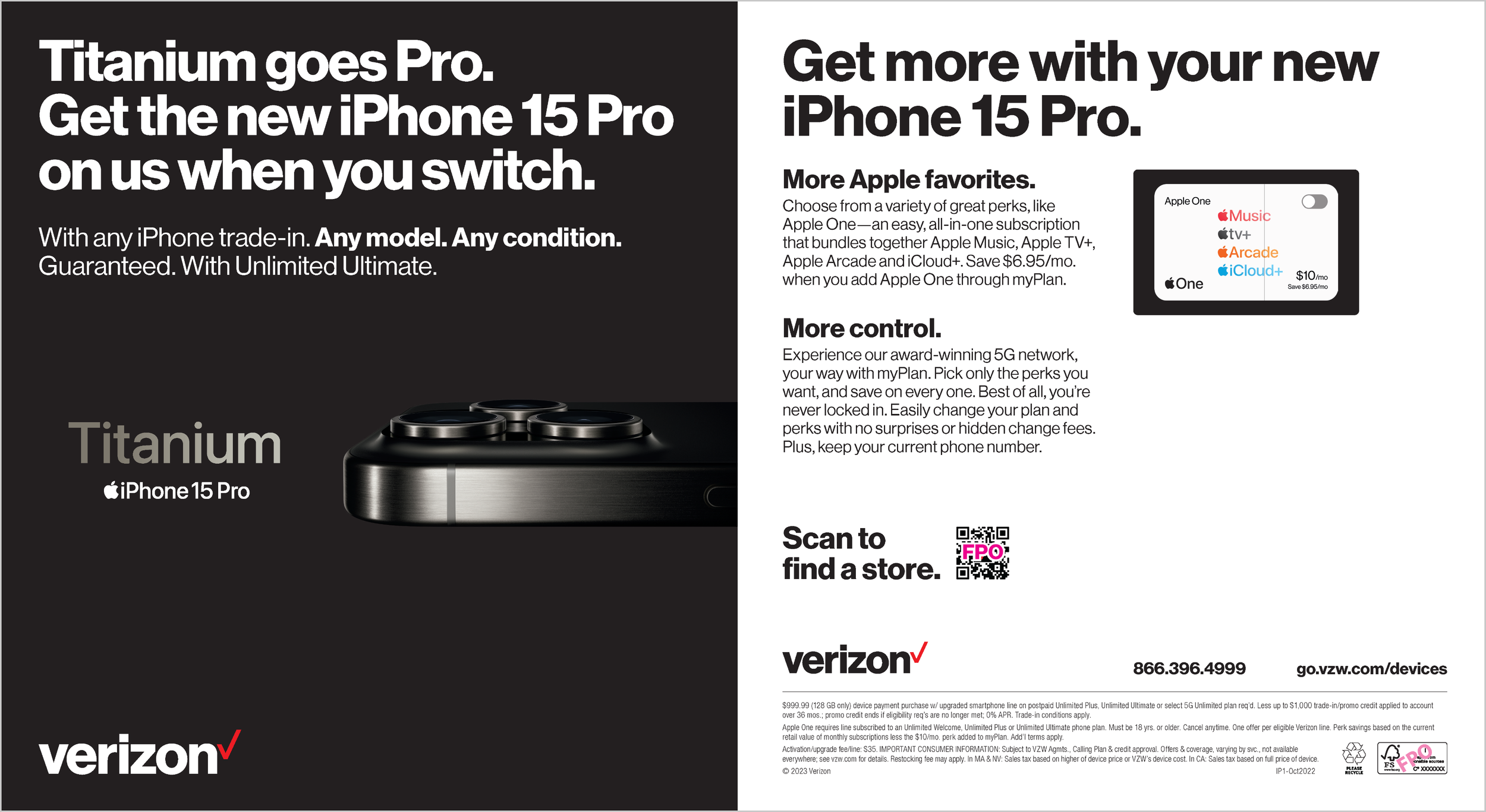
Same job, sell a phone trade-in, told two different ways. The earlier piece leans on bold color and scale for urgency; the later one uses restraint, black space, product photography doing the persuading instead of the type.
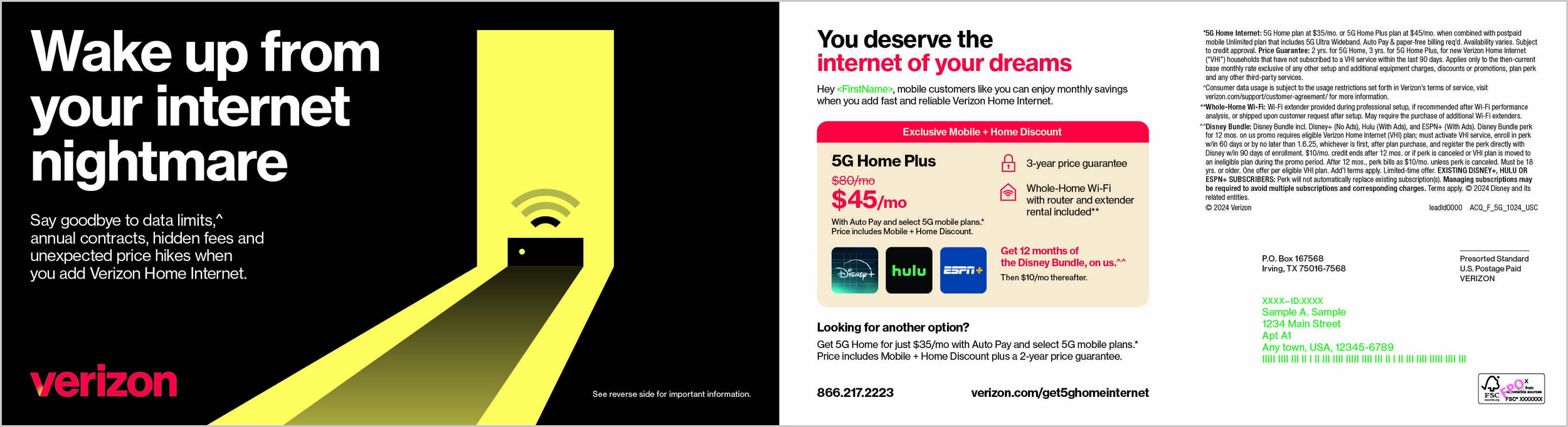
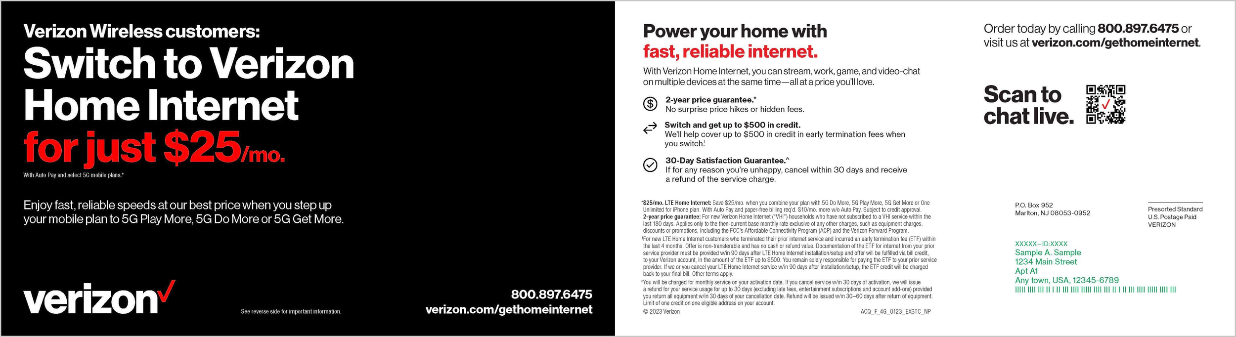
The one where the change isn't palette, it's craft. Both sell the same price point, but the earlier piece states the value proposition as a headline. The later one builds an actual idea around it, a metaphor, a visual moment, rather than just stating the number louder.
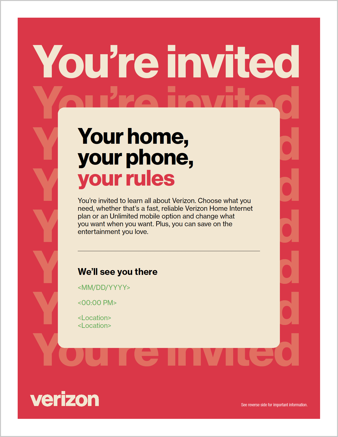
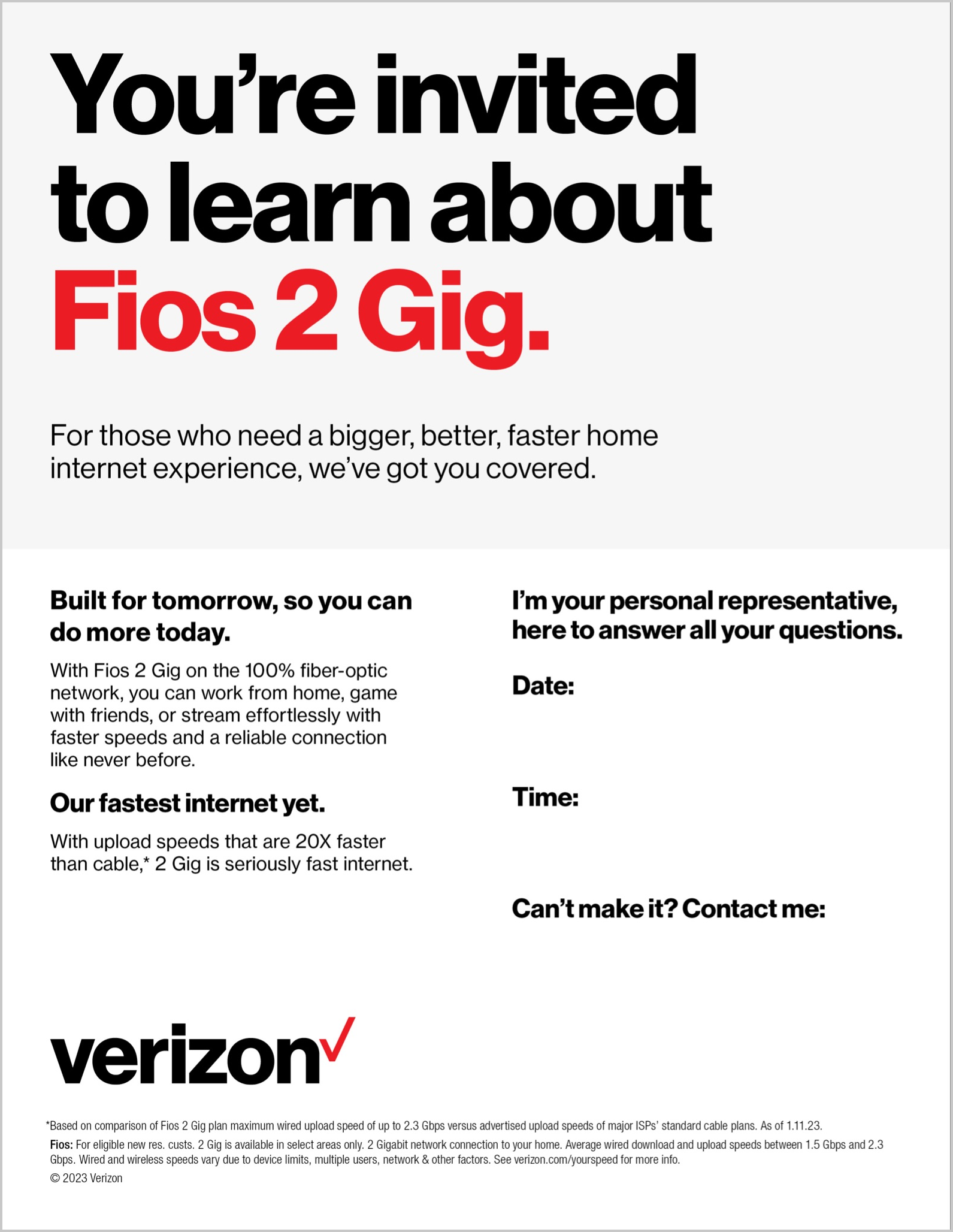
Same use case, an event invite flyer, different eras of the system. Useful pairing because the format constraint is identical, so the visual language is the only variable.
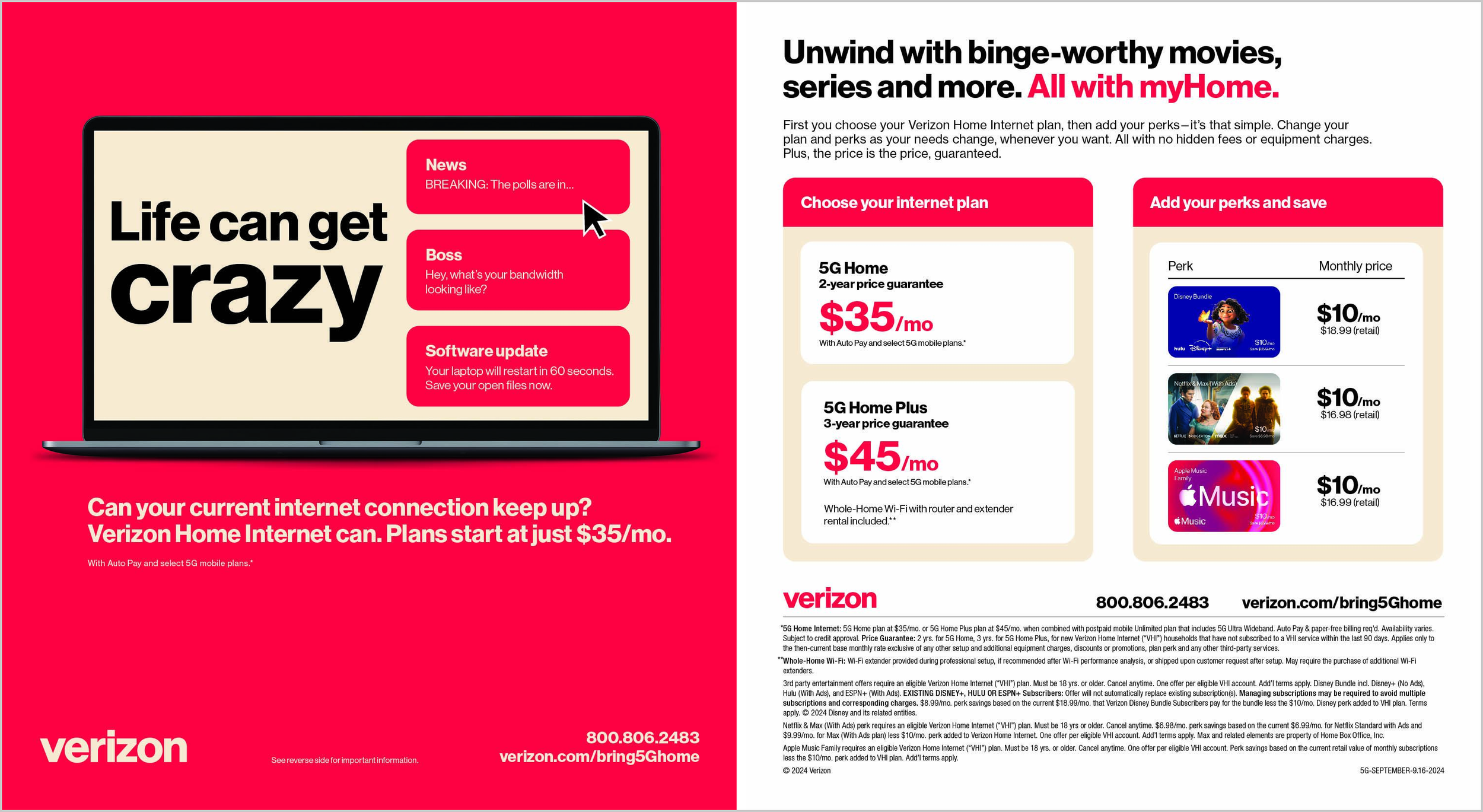
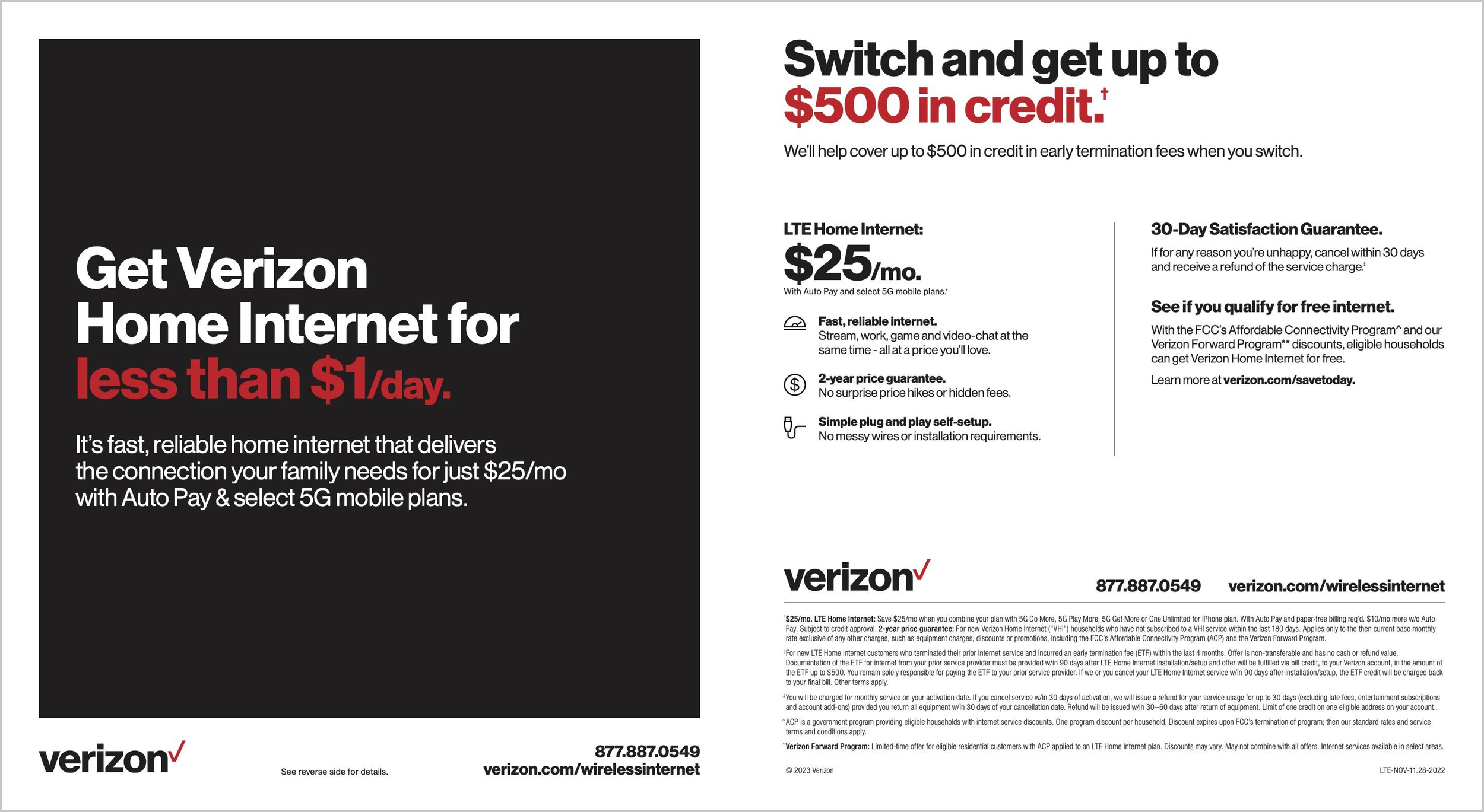
The loosest pair of the six, not identical campaigns, but both FWA value pieces close enough in function that the system contrast still reads clearly.